- Home
- Promotional Products
- Backpacks & Suitcases
- Sports Bag in Sturdy Fabric DENIM BAG


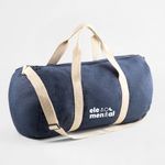

Durable sports bag for the gym or weekend getaways
Functional denim design with adjustable shoulder strap
The DENIM BAG is the ideal companion for workouts or casual trips. Its denim fabric look combines durability with a laid-back style, offering generous space and comfortable transport.
With a front pocket, double zipper, and reinforced seams, it ensures both organisation and longevity. The adjustable shoulder strap in cotton and strong webbing handles make it easy to carry—even when fully loaded.
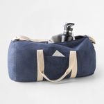
- Spacious interior with zippered front pocket
- Total capacity of 25 L
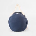
- Size: Ø260 x 480 mm | Weight: 249 g
- Reinforced seams and sturdy double zipper
Ref.: 92095
Sports Bag in Sturdy Fabric DENIM BAG (Backpacks & Suitcases)
Share
How would you like to create your design?
Order within 00 hrs 00 mins 00 secs to guarantee your delivery date.
Designs
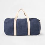
DENIM BAG for stylish sports and travel use
Perfect for anyone looking for a bag with personality and toughness, the DENIM BAG merges practicality with a relaxed look. Whether for daily routines, gym sessions, or short trips, this bag stands out with its denim style and adaptability.
Durability, comfort, and reinforced details
Made from denim fabric, this bag offers strong structure and reinforced seams for long-lasting use. Its cylindrical shape is practical and features a zippered front pocket, durable cotton handles, and an adjustable shoulder strap up to 130 cm for added comfort.
Customise your DENIM BAG with the Ask-to-Print Online Editor
At Ask-to-Print, you can add your logo or design directly onto the DENIM BAG using the online editor. Enjoy real-time previews, intuitive editing, or upload a ready-made file. Personalisation is simple, professional, and adaptable to any brand or promotional use.
Buy the DENIM BAG for style and functionality
An affordable option with visual impact—ideal as a promotional gift or personal accessory. This practical, low-cost and long-lasting bag will enhance your brand’s image with both function and flair. Order now at Ask-to-Print!
FAQs
Backpacks & Suitcases
We offer a wide range of products, including laptop backpacks, conference bags, sports backpacks, cooler bags, shoulder bags, waist bags, and cases for tablets and laptops. Each model is designed to suit different lifestyles and use contexts: professional, sports, urban, or promotional.
Yes, all models can be customized with your brand or visual identity. The most common printing techniques are screen printing, transfer, DTF, and embroidery. Customization can be applied in different locations depending on each model's printable area.
Yes, many backpacks and bags are ideal for corporate gifts and promotional campaigns. We offer models with excellent value for money, a modern look, and prominent logo placement — perfect for loyalty actions, onboarding, or corporate events.
Some models feature water-resistant materials such as 600D or 900D polyester with waterproof coating. However, not all are fully waterproof. Please check the technical description of each product to confirm moisture resistance.
Yes, we offer backpacks and bags made from recycled or natural materials such as recycled polyester (rPET), recycled cotton, jute, cork, and recycled PET. These models provide a sustainable solution without compromising functionality or design.
Several models — especially laptop backpacks and tablet sleeves — include padded compartments to protect devices from impact. This feature is highlighted in the descriptions of tech-oriented products.
Sizes vary, but laptop backpacks typically support screens of 14", 15.6", or 17.3". There are also compact models or larger capacity ones (over 20 liters), suited for travel or outdoor activities.
Yes, many models include adjustable padded straps, breathable mesh backs, chest straps, or lumbar support belts. These features provide comfort during prolonged use, especially for daily commutes or long trips.
Retention time depends on the thermal insulation and inner lining thickness. In general, models with quality aluminum or PEVA lining maintain food and beverage temperatures for several hours — ideal for picnics, the beach, or work.
For events, we recommend lightweight models with good print areas and a modern look. Shoulder bags, crossbody bags, or compact backpacks are great options, offering immediate utility to users and excellent brand visibility.
Most products are made from 600D or 900D polyester — durable, lightweight, and tear-resistant fabrics. Others include cotton (natural or recycled), jute, canvas, cork, rPET (recycled plastic), PEVA and EVA (in thermal linings), and PU or synthetic leather details in premium models.
These codes refer to fabric density. The number (e.g., 600D) indicates the thickness and strength of the yarn used. The higher the number, the more resistant and durable the fabric. 600D polyester is one of the most common in promotional backpacks due to its balance of lightness and strength.
For polyester or technical fabrics, screen printing and transfer are the most suitable. DTF offers vibrant colors in small areas. Embroidery is ideal for cotton, jute, and thicker fabrics. For products with thermal linings (PEVA, aluminum), printing is done on the exterior.
Printing and Production
To ensure a professional result when printing your graphic project, it's essential to follow a series of best practices. The file must be created from scratch using the correct format and dimensions, respecting the technical areas defined for bleed, trim and safety. Below is a full guide to correctly prepare your print-ready file.
1. Start with the correct final size
From the start, define the exact size of the final product. Avoid designing in a different size and adjusting it later. This ensures all elements remain proportional and well positioned, avoiding errors at export or printing stage.
2. Use bleed and safety margins
- Bleed: extend all visual elements at least 2 mm beyond the trim line.
- Trim line: indicates where the product will be physically cut.
- Safety area: keep text and important elements at least 3 mm from the trim line.
- Fold lines: avoid placing text too close to folds. Keep a safe distance from folds for legibility and to avoid distortion.
3. Balance visual hierarchy
Distribute page elements well: maintain good proportion between text, images, and white space. Make sure the content is clear, well-organised and visually harmonious. Overcrowded designs can confuse or impair reading.
4. Choose legible and proportional fonts
- Avoid overly thin or decorative fonts for text blocks.
- Use appropriate font sizes — ideally test with a full-size print to confirm legibility.
- Ensure good contrast between text and background for easier reading.
5. Use images with adequate resolution
- Images should be at least 300 dpi at final print size.
- Avoid using web images, as they usually have low resolution and compromise visual quality. If used, always check the resolution.
- Ensure all images are in CMYK mode. RGB images may shift in colour when printed. Remember, printing is always done in CMYK colour mode.
6. Proofread all text before exporting
- Check for spelling or grammatical errors.
- Verify that all titles, headings and text blocks are correctly aligned and styled.
- When exporting, embed fonts in the PDF or convert them to outlines.
7. Define a consistent visual style
Choose a colour palette, typography and graphic style consistent with your brand or product purpose. A consistent design communicates professionalism and clarity.
8. Use the supplied design template
When using templates from the platform or the free Ask-to-Print Online Editor, place elements according to the guide lines. These lines indicate bleed, trim, fold and safety zones. You can also start your project from scratch in the editor and ensure proper element positioning.
9. Be careful with free online editors
Some online PDF editors don't correctly embed fonts, which can lead to font replacements or display issues. When possible, export the PDF with full font embedding and validate using a professional PDF viewer.
10. Use proper tools to create your design
To properly prepare your file, use the Ask-to-Print Online Editor or professional graphic software that supports technical margin setup and professional formats.
Common professional solutions include Adobe Illustrator, InDesign, Photoshop and CorelDRAW. These programs offer full control over vectors, fonts, bleeds and layers — ideal for advanced graphic production.
For free options, consider Canva (Pro version recommended for export), Inkscape (vector-based) and GIMP (image editing). While less robust, these tools can deliver quality files when used within printing specs.
11. Export correctly to PDF for print
Once your design is finished, export the file as PDF, following these essential requirements to ensure quality and print compatibility:
- Embed all fonts in the final PDF (prevents errors and substitutions).
- Ensure images are CMYK and 300 dpi at final print size.
- Use the PDF/X-1a export profile — ensures compatibility with prepress systems and printing machines.
- Include external bleed and visible trim marks when margin validation is required.
For step-by-step guides on how to export correctly in each program, see our PDF print export FAQ.
The bleed margin (also called bleeding margin or by the English term bleed) is an additional area around the final design that must be included in the artwork file to ensure a clean and accurate cut. During the finishing process, slight variations of 1 to 2 mm in trimming are common. Bleed prevents these from resulting in unwanted white edges.
How to identify the bleed margin?
If you downloaded the template or used the online editor: you’ll find lines in different colours.
- The black line indicates the bleed margin.
- The red line indicates the cut line.
- The green line indicates the safety margin.
How to use the bleed margin correctly?
Always extend backgrounds, colours or background images up to the bleed margin — even if they don’t contain relevant elements. This ensures that, after cutting, no white stripes appear along the edges.
Practical example:
A design with a coloured background ending exactly at the cut line may show white borders if the trim shifts slightly. By extending the background to the bleed, this risk is eliminated.
Bleed margin dimensions by product type
| Bleed Margin | Products |
|---|---|
| 2 mm | All small and medium-size print products |
| 5 mm | All large format products and cardboard packaging |
| 10 mm | Corrugated cardboard packaging and shipping materials |
If you use our templates or our Online Editor, the bleed margins are already set automatically. Just follow the guide lines to ensure the correct placement of elements.
What is the Safety Margin?
Besides the bleed, it’s also important to respect the safety margin — an inner zone where all essential design elements should be placed to avoid being cut or ending up too close to the edge, compromising layout and readability.
Why is the safety margin necessary?
During trimming, small variations may occur. If text or logos are too close to the cut line, they risk being trimmed or becoming illegible. The safety margin ensures these elements remain intact and clearly visible.
How to correctly apply the safety margin?
- Keep text, logos and key graphic elements at least 3 mm from the cut line (or more, depending on the product).
- Avoid placing content near fold lines or technical cutting marks.
- Check that elements respect the area defined in the template (continuous red line).
Visual summary:
- Bleed (grey): extra area outside the cut → for backgrounds and images.
- Cut line (red): where the product will be physically trimmed.
- Safety margin (green): protected area → for text and key elements.
Respecting these technical areas ensures a professional finish, free from errors or unexpected results.
At Ask-to-Print, we accept various file formats to ensure the best customization and production experience. However, not all formats offer the same features in the design checking and adjustment process.
See below for file type details:
Files with Preview and Editable Options (recommended and preferred)
- .pdf (Adobe Acrobat)
- .png (PNG Image)
- .jpeg / .jpg (JPEG Image)
- .tiff (TIFF Image)
- .svg (Vector Graphic)
Files with Preview, No Editing Options
- .ai (Adobe Illustrator)
- .eps (PostScript)
- .gif (GIF Image)
Accepted Files, No Preview or Editing Options
- .psd (Adobe Photoshop)
- .cdr (CorelDRAW)
Files Not Accepted by the Platform
- .ppt (Microsoft PowerPoint)
- .doc (Microsoft Word)
- .bmp (Bitmap Image)
Still have questions?
If you're unsure about the correct format or are having trouble uploading your file, our Customer Support team is here to help. Don’t hesitate to contact us — we’ll be happy to assist and ensure your order runs smoothly.
To contact us click here!
When preparing a file for printing, it's essential to understand the difference between the two main colour models used in graphic design: CMYK and RGB. Although both allow for attractive visuals, they serve different purposes and produce different results — especially in print processes.
What are CMYK and RGB colours, and which should I use for printing?
CMYK – The colour model for printing
CMYK stands for Cyan, Magenta, Yellow, and Black. It is the colour model used in all professional printing processes. Colours are created by overlaying percentages of these four inks in layers on the printed surface.
- Used in offset and digital printing.
- Based on subtractive colour from reflected light — unlike screen-emitted light.
- Reproduces a more limited colour gamut, but one suited to the physical printing process.
RGB – Colour model for screens
RGB stands for Red, Green, and Blue. It’s a light-emitting colour model used for displaying colours on digital screens such as monitors, tablets, or smartphones. This model can produce much more vibrant and saturated colours than CMYK.
- Ideal for digital images, videos, and websites.
- Offers a wider colour gamut — meaning it covers more possible colours.
- Colours may appear more intense on screen than what can be printed.
What is colour gamut?
The gamut is the range of colours that a given colour model or device can reproduce. The RGB model has a wider gamut than CMYK, meaning it can display colours that simply cannot be printed with standard inks.
When a file created in RGB is automatically converted to CMYK, colours outside the CMYK gamut are adjusted to approximate values. This can result in noticeable visual differences between what is seen on screen and what gets printed — especially with certain RGB-exclusive or highly vibrant tones.
Which should I use when preparing files for print?
You should always work in CMYK colour mode when creating files intended for print. This ensures that what you see during design stays closer to what can realistically be printed.
If you're using design programs such as Adobe Illustrator, InDesign, or Photoshop, set the colour space to CMYK from the start. On Canva, choose CMYK export (available on the Pro version). This practice prevents colour fidelity loss.
On the Ask-to-Print Online Editor, there’s no need to worry: all files are automatically generated in CMYK with optimised colour management.
Useful tip for professionals and beginners
Even when working in CMYK, differences between screen and print may persist. We recommend using a physical CMYK colour guide to visualise true tonal values before finalising your design. This is especially helpful for branding or colour-critical materials.
When creating a design using very specific fonts or fonts that may not be available in our system, those fonts may be automatically replaced with standard fonts, which can significantly alter the appearance of your printed material.
How does this happen?
If the font used in your design is not embedded in the file or is not a common font recognized by our system, the print software will attempt to replace it with a similar one. However, this substitution may cause your design to lose its original appearance, affecting spacing, formatting and layout.
How to avoid this issue?
To ensure your design prints exactly as intended, follow these steps:
- Embed fonts in the final file: Make sure all fonts used in your project are properly embedded in the design file. This can be done when exporting the file from your design software (such as Illustrator, InDesign, Corel Draw, or others).
- Convert text to outlines: If you can’t embed the fonts, an alternative is to convert the text to outlines (or paths). This transforms the text into vector shapes, eliminating the need for external fonts. Note: This option is not recommended for products like Books, Magazines or Catalogues, as outlined text cannot be edited later.
- Check fonts and images in your file: Graphic design software such as Illustrator offers tools to ensure everything is correct before sending your file to print. One way to do this is to generate a final report that lists all fonts used and includes details about images, such as whether they are in CMYK or RGB mode (remember that for printing, images must be in CMYK).
- To generate the report in Illustrator:
- Go to the “File” menu > “Package”.
- In the Package options panel, check the boxes to include fonts and images.
- Illustrator will create a folder with all your project files, including embedded fonts, images (with CMYK or RGB info), and other essential details.
- To generate the report in Illustrator:
- Use the Illustrator Package feature: This is ideal to ensure that all resources required for your project are properly delivered. The Package generates a folder containing all design elements (fonts, images, colours, and more), making it easier to review everything.
Summary
To avoid font issues and ensure your design prints exactly as intended, embed fonts or convert them to outlines.
Embedding fonts in a PDF is essential to ensure the file is viewed and printed correctly on devices that may not have the same fonts installed. This practice is especially important in web-to-print environments, where files are prepared by end users and sent directly to print production.
What does embedding fonts mean?
When you embed fonts in a PDF file, the font data is included directly within the document. This preserves the text’s appearance, even if the PDF is opened on different computers, using different systems or without the original fonts installed.
How to embed fonts – General Steps
Adobe InDesign, Illustrator and Photoshop
- Go to File > Export and choose the Adobe PDF format.
- Access the Advanced tab.
- Enable the option Embed All Fonts or Subset fonts below 100%.
- Select a profile like PDF/X-1a or PDF/X-4, suitable for professional printing.
CorelDRAW
- Go to File > Export > PDF.
- In the Advanced tab, select Embed All Fonts.
Other programs (Affinity Designer, Canva, Inkscape, GIMP, etc.)
- Most export to PDF with fonts embedded by default.
- Always check export options for terms like "embed fonts" or "PDF/X compliance".
Best Practices for Web-to-Print
- Converting text to outlines is a safe option if the file doesn’t need further editing.
- Only use licensed fonts to avoid embedding restrictions.
- Avoid online fonts from cloud editors that don’t allow embedding.
What is rich black and when should it be used?
In graphic design for print, there are two main ways to apply black: plain black (100% K) and rich black. While both may look the same on screen, the printed result can differ significantly depending on the method used.
Plain black (100% K)
Plain black uses only black ink (K = 100%) in the CMYK model. It is ideal for text and fine elements, ensuring clarity, readability and no registration issues. However, when used in large solid areas (e.g., backgrounds), it may appear dull or greyish, as it relies on a single layer of ink.
Rich black – Greater intensity and depth
Rich black is created by combining black ink with controlled amounts of cyan, magenta and yellow (CMY). This blend enhances visual density and results in a deeper, more even black. It is especially effective for dark backgrounds, large blocks or visually impactful elements.
A safe and commonly used rich black formula is:
- C: 60%
- M: 40%
- Y: 40%
- K: 100%
These percentages may vary slightly depending on the paper type and print profile, but total ink coverage must always be respected.
Best practices when using rich black
- Use plain black (100% K) for text, fine lines and small elements — avoids registration issues.
- Use rich black for large areas, dark backgrounds or impactful visuals.
- Avoid using 100% for all colours (C+M+Y+K), as it may cause ink overload and drying issues — use our recommended formula instead.
To ensure your file is ready for printing with special and highlight graphic finishes, it is essential to correctly prepare all embellishment elements.
This procedure applies to any product involving one or more of the following finishes:
- Spot UV varnish
- 3D varnish
- Embossing (raised and recessed)
- Stamped embossing
- Gold or silver foil
- Metallic effects
These effects can be combined with special cutting (CutContour). Therefore, each finish must be placed on a separate layer, with a properly assigned technical colour (Spot Colour) and the Overprint attribute always activated.
1. Use only vector elements
All special finish elements must be vector-based (not rasterized) to ensure accuracy and quality. Avoid using images or pixelated effects.
2. Create a separate layer for each finish type
Each finish must be placed on a distinct layer, with a specific technical name and dedicated Spot Colour application (see below).
3. Draw clean and closed paths
Avoid overlapping shapes, sharp angles or open paths. Use tools like Pathfinder (Illustrator) to unite, intersect or combine elements — ensuring simple and precise outlines.
4. Layer names and colours for finishes
According to the type of finish, you should create a specific layer with the correct technical name and apply a Spot Colour with the values defined below. All elements must have the Overprint attribute activated.
- Layer: Finishing
For: Spot UV varnish, 3D varnish, gold or silver foil, metallic effects
Spot Colour: C 0% M 50% Y 100% K 0% (orange tone)
Important: Elements must be vector-based and placed exclusively in this layer. Do not duplicate elements in other layers. - Layer: Emboss
For: Raised embossing, recessed embossing
Spot Colour: C 50% M 100% Y 0% K 0% (purple tone)
Important: The embossing must be drawn with closed vector shapes and properly aligned with the base artwork.
Attention: In cases where finishes are combined. If stamped embossing is required, you must create two separate layers with the respective configurations described above:
- Layer: Finishing + Layer: Emboss
For: Stamped embossing (combination of foil and embossing)
Configuration: Both layers must be correctly configured, with separated and aligned vector elements, without incorrect overlaps or duplications.
Additional note: If your product includes a customised special die cut, you must also set up an additional layer with the corresponding path:
- Layer: CutContour
For: Custom special cutting
Spot Colour: C 0% M 100% Y 100% K 0% (red)
Important: The cutting path must be vector-based, closed and placed on a separate layer. Avoid sharp angles and overlapping paths.
5. Activate overprint
All finish paths must have Overprint activated. This ensures the finish will be printed over the artwork without interference or failures.
6. Organise the layers correctly
- Artwork – layer with the main design (text, images, etc.)
- Finishing – for varnish, foil and metallics
- Emboss – for embossing
- CutContour – for cutting
- Do not duplicate elements between layers
7. Important technical care for special finishes
- Minimum text size: 10 pt
- Minimum line thickness: 1 pt
- Minimum distance between finish lines: 1 pt
- Safety margin: at least 3 mm between finish and cutting or creasing lines
8. Layer alignment
If the finish (varnish, foil or embossing) must align exactly with artwork elements, ensure that elements in the Artwork, Finishing,Emboss and CutContour layers are perfectly aligned.
9. Recommended tools
To correctly prepare your file, use vector illustration software such as Adobe Illustrator, CorelDRAW or InkScape, or other tools compatible with layers and spot colours.
Need help?
If you have any questions or need support, our team is always available to help you. To check our contacts click here.
At Ask-to-Print, you can request a custom cut for various types of products. This cut refers to a shape that differs from the traditional rectangular or square format — such as special contours, curves, interior cutouts or decorative forms.
In the graphic industry, the term custom cut is often referred to as a “die cut” or “cutting line”, and applies both to the traditional blade-based process and to digital cutting (laser or cutting table), which is commonly used for large formats.
How to create a file with a custom cut
If your order includes a custom cut, please prepare your file as follows:
- Create a layer named CutContour.
- Draw the cutting path in the desired shape. The path must be made of continuous and closed vectors.
- Apply a Spot Color named CutContour to the path, using 100% magenta.
- If there are overlapping vectors, make sure they are combined properly.
Important technical rules
- The cutting path must be vector-based — raster images (JPEG, PNG, TIFF) are not valid.
- Ensure the line is closed and has no overlaps.
- Follow the product template guidelines for minimum radii and minimum width of cut areas.
- Avoid overly complex shapes such as tight curves or sharp angles.
- All printable elements must be on a separate layer named Artwork.
- The magenta cutting line will not be printed — it is only a technical reference for the cut.
Bleed and cutting line
To ensure a flawless result and avoid unwanted white edges, the cutting path should slightly overlap the image. Therefore, we recommend applying a minimum bleed of 3 mm for small formats and 5 mm for large formats around the cut area. This ensures the background or image extends beyond the cut line, providing a continuous and clean finish.
Recommended software
To properly prepare the custom cut, use vector illustration software such as Adobe Illustrator, CorelDRAW, InkScape, or other tools compatible with layers and spot colors.
Need help?
If you have any questions or need assistance, our team is always available to help. To check our contact details, click here.
Yes, you can view a proof before printing.
If you use our online editor, you’ll get instant access to a real-time preview of your design, accurately simulating the final result.
If you choose to upload your design or final artwork, you will also be able to preview the job before production — as long as the file is in one of the following formats compatible with digital proofing:
- PDF: Standard format for design previews.
- JPEG and JPG: Image format
- PNG
- GIF: Supported in the proofing process, allowing visual validation before printing.
- Tiff
- AI
- SVG
We accept many other formats, but only these allow automatic job preview generation.


