




Thermal comfort and functionality for everyday work
A durable fleece jacket designed for professional use
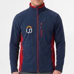
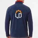
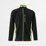
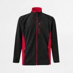
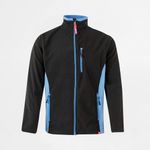
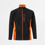
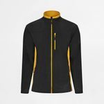
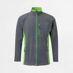
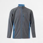
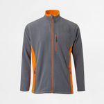
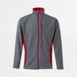
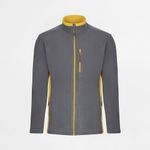
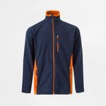
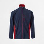
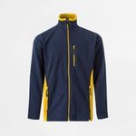
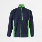
The Two-Tone Fleece Jacket VELILLA GERAS 201504 has been developed to provide excellent thermal insulation, comfort, and practicality for professional environments and everyday wear. Manufactured from 100% polyester microfibre fleece, it offers a soft feel, outstanding warmth, and excellent resistance to everyday use. The contemporary two-tone design with contrasting side panels, inner collar, and zip details gives the garment a modern appearance, while the five practical pockets provide convenient storage for essential items.
- 100% polyester microfibre fleece (220 g/m²)
- Full front zip fastening
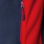
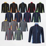
- Contrasting colour on the side panels, inside collar, and zips
- Five pockets: 3 zipped outer pockets and 2 inner pockets
- Excellent thermal insulation with a soft-touch finish
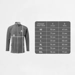
- Sizes: XS, S, M, L, XL, 2XL and 3XL
Ref.: 36079 / 201504
How would you like to create your design?
In the next step, choose how you would like to handle your design.
To keep your estimated delivery date, complete your order by .
Designs
Reliable warmth for demanding working environments
The Two-Tone Fleece Jacket VELILLA GERAS 201504 has been designed to keep professionals warm and comfortable throughout the working day. Its lightweight polyester microfibre fleece provides excellent thermal insulation while remaining breathable, making it ideal for cooler indoor environments and outdoor activities without restricting freedom of movement.
High-quality microfibre for long-lasting performance
Manufactured from premium 220 g/m² polyester microfibre, this fleece jacket combines softness with excellent durability. The fabric withstands frequent washing, dries quickly, and retains both its appearance and thermal properties over time, making it an ideal choice for intensive professional use.
Practical storage with five functional pockets
The five well-positioned pockets allow users to safely carry tools, mobile phones, wallets, documents, and other everyday essentials. The three zipped outer pockets keep personal belongings secure, while the two inner pockets provide additional protected storage for valuable items or work equipment.
Modern styling ready for professional branding
The two-tone design, enhanced by contrasting side panels, inner collar, and zip details, creates a contemporary professional appearance. The jacket also provides an excellent surface for embroidery and other customisation techniques, making it ideal for companies looking to reinforce their corporate identity through branded workwear.
A versatile solution for multiple industries
This fleece jacket is perfectly suited to professionals working in logistics, warehousing, maintenance, manufacturing, technical services, transport, retail, gardening, and many other sectors. It is equally suitable for casual everyday wear thanks to its lightweight construction, exceptional comfort, and timeless design.
Buy the Two-Tone Fleece Jacket VELILLA GERAS 201504 at the best price-quality ratio
If you are looking for an affordable, comfortable, and durable fleece jacket, the Two-Tone Fleece Jacket VELILLA GERAS 201504 is an excellent choice. We offer a low-cost solution for businesses and individuals seeking high-quality professional clothing while maintaining an economical option without compromising comfort, durability, or professional appearance.
| Placement | Sizes | Maximum print area |
|---|---|---|
| Right Chest | All sizes | 120 × 60 mm |
| Left Chest | All sizes | 100 × 100 mm |
| Back | All sizes | 254 × 254 mm |
| Right Sleeve | All sizes | 80 × 40 mm |
| Left Sleeve | All sizes | 80 × 40 mm |
FAQs
Printing and Production
To ensure a professional result when printing your graphic project, it's essential to follow a series of best practices. The file must be created from scratch using the correct format and dimensions, respecting the technical areas defined for bleed, trim and safety. Below is a full guide to correctly prepare your print-ready file.
1. Start with the correct final size
From the start, define the exact size of the final product. Avoid designing in a different size and adjusting it later. This ensures all elements remain proportional and well positioned, avoiding errors at export or printing stage.
2. Use bleed and safety margins
- Bleed: extend all visual elements at least 2 mm beyond the trim line.
- Trim line: indicates where the product will be physically cut.
- Safety area: keep text and important elements at least 3 mm from the trim line.
- Fold lines: avoid placing text too close to folds. Keep a safe distance from folds for legibility and to avoid distortion.
3. Balance visual hierarchy
Distribute page elements well: maintain good proportion between text, images, and white space. Make sure the content is clear, well-organised and visually harmonious. Overcrowded designs can confuse or impair reading.
4. Choose legible and proportional fonts
- Avoid overly thin or decorative fonts for text blocks.
- Use appropriate font sizes — ideally test with a full-size print to confirm legibility.
- Ensure good contrast between text and background for easier reading.
5. Use images with adequate resolution
- Images should be at least 300 dpi at final print size.
- Avoid using web images, as they usually have low resolution and compromise visual quality. If used, always check the resolution.
- Ensure all images are in CMYK mode. RGB images may shift in colour when printed. Remember, printing is always done in CMYK colour mode.
6. Proofread all text before exporting
- Check for spelling or grammatical errors.
- Verify that all titles, headings and text blocks are correctly aligned and styled.
- When exporting, embed fonts in the PDF or convert them to outlines.
7. Define a consistent visual style
Choose a colour palette, typography and graphic style consistent with your brand or product purpose. A consistent design communicates professionalism and clarity.
8. Use the supplied design template
When using templates from the platform or the free Ask-to-Print Online Editor, place elements according to the guide lines. These lines indicate bleed, trim, fold and safety zones. You can also start your project from scratch in the editor and ensure proper element positioning.
9. Be careful with free online editors
Some online PDF editors don't correctly embed fonts, which can lead to font replacements or display issues. When possible, export the PDF with full font embedding and validate using a professional PDF viewer.
10. Use proper tools to create your design
To properly prepare your file, use the Ask-to-Print Online Editor or professional graphic software that supports technical margin setup and professional formats.
Common professional solutions include Adobe Illustrator, InDesign, Photoshop and CorelDRAW. These programs offer full control over vectors, fonts, bleeds and layers — ideal for advanced graphic production.
For free options, consider Canva (Pro version recommended for export), Inkscape (vector-based) and GIMP (image editing). While less robust, these tools can deliver quality files when used within printing specs.
11. Export correctly to PDF for print
Once your design is finished, export the file as PDF, following these essential requirements to ensure quality and print compatibility:
- Embed all fonts in the final PDF (prevents errors and substitutions).
- Ensure images are CMYK and 300 dpi at final print size.
- Use the PDF/X-1a export profile — ensures compatibility with prepress systems and printing machines.
- Include external bleed and visible trim marks when margin validation is required.
For step-by-step guides on how to export correctly in each program, see our PDF print export FAQ.
At Ask-to-Print, we accept various file formats to ensure the best customization and production experience. However, not all formats offer the same features in the design checking and adjustment process.
See below for file type details:
Files with Preview and Editable Options (recommended and preferred)
- .pdf (Adobe Acrobat)
- .png (PNG Image)
- .jpeg / .jpg (JPEG Image)
- .tiff (TIFF Image)
- .svg (Vector Graphic)
Files with Preview, No Editing Options
- .ai (Adobe Illustrator)
- .eps (PostScript)
- .gif (GIF Image)
Accepted Files, No Preview or Editing Options
- .psd (Adobe Photoshop)
- .cdr (CorelDRAW)
Files Not Accepted by the Platform
- .ppt (Microsoft PowerPoint)
- .doc (Microsoft Word)
- .bmp (Bitmap Image)
Still have questions?
If you're unsure about the correct format or are having trouble uploading your file, our Customer Support team is here to help. Don’t hesitate to contact us — we’ll be happy to assist and ensure your order runs smoothly.
To contact us click here!
When preparing a file for printing, it's essential to understand the difference between the two main colour models used in graphic design: CMYK and RGB. Although both allow for attractive visuals, they serve different purposes and produce different results — especially in print processes.
What are CMYK and RGB colours, and which should I use for printing?
CMYK – The colour model for printing
CMYK stands for Cyan, Magenta, Yellow, and Black. It is the colour model used in all professional printing processes. Colours are created by overlaying percentages of these four inks in layers on the printed surface.
- Used in offset and digital printing.
- Based on subtractive colour from reflected light — unlike screen-emitted light.
- Reproduces a more limited colour gamut, but one suited to the physical printing process.
RGB – Colour model for screens
RGB stands for Red, Green, and Blue. It’s a light-emitting colour model used for displaying colours on digital screens such as monitors, tablets, or smartphones. This model can produce much more vibrant and saturated colours than CMYK.
- Ideal for digital images, videos, and websites.
- Offers a wider colour gamut — meaning it covers more possible colours.
- Colours may appear more intense on screen than what can be printed.
What is colour gamut?
The gamut is the range of colours that a given colour model or device can reproduce. The RGB model has a wider gamut than CMYK, meaning it can display colours that simply cannot be printed with standard inks.
When a file created in RGB is automatically converted to CMYK, colours outside the CMYK gamut are adjusted to approximate values. This can result in noticeable visual differences between what is seen on screen and what gets printed — especially with certain RGB-exclusive or highly vibrant tones.
Which should I use when preparing files for print?
You should always work in CMYK colour mode when creating files intended for print. This ensures that what you see during design stays closer to what can realistically be printed.
If you're using design programs such as Adobe Illustrator, InDesign, or Photoshop, set the colour space to CMYK from the start. On Canva, choose CMYK export (available on the Pro version). This practice prevents colour fidelity loss.
On the Ask-to-Print Online Editor, there’s no need to worry: all files are automatically generated in CMYK with optimised colour management.
Useful tip for professionals and beginners
Even when working in CMYK, differences between screen and print may persist. We recommend using a physical CMYK colour guide to visualise true tonal values before finalising your design. This is especially helpful for branding or colour-critical materials.
Yes. The PDF/X-1a format is accepted by Ask-to-Print and is one of the most recommended options for finalised files. This format ensures that your design is reproduced accurately, preserving embedded fonts, CMYK colours and removing transparencies that may cause printing issues. If your file is production-ready, PDF/X-1a is an excellent choice.
Does Ask-to-Print recommend the PDF/X-1a format?
We strongly recommend using PDF/X-1a whenever uploading a finalised file, especially for technically demanding products such as business cards, flyers or catalogues. This format offers greater compatibility with our production systems and reduces the chance of errors related to fonts, colours or bleed margins.
When should I use the PDF/X-1a format?
PDF/X-1a is ideal for files that require no further editing and are ready for print. If you created your design in software like Adobe Illustrator, InDesign or CorelDRAW and want to preserve the exact layout, this is the safest format. It's especially useful for designs with pure CMYK colours, high-resolution images and where final alignment is crucial.
Does PDF/X-1a guarantee better print quality?
More than quality, PDF/X-1a guarantees consistency and reliability. It prevents issues like font substitution, incorrect colour profiles or unhandled transparencies. The visual quality also depends on resolution and layout, but this format ensures what you see on screen is what gets printed — no surprises.
How can I generate a PDF/X-1a file?
You can generate a PDF/X-1a from programs like Adobe Illustrator, InDesign, Photoshop or CorelDRAW. Just select “Save as PDF” and choose the PDF/X-1a:2001 preset. Make sure to use CMYK colour mode, include 3 mm bleed and convert text to outlines. You can also download our pre-configured templates to simplify the process.
What are the advantages of sending a file in PDF/X-1a?
Better print safety; Preserves fonts, images and colours; Reduces technical error risks; Compatible with prepress systems; Prevents layout surprises. By choosing this format, you're ensuring your file meets best practices in the graphic arts industry.
At Ask-to-Print, you can request a custom cut for various types of products. This cut refers to a shape that differs from the traditional rectangular or square format — such as special contours, curves, interior cutouts or decorative forms.
In the graphic industry, the term custom cut is often referred to as a “die cut” or “cutting line”, and applies both to the traditional blade-based process and to digital cutting (laser or cutting table), which is commonly used for large formats.
How to create a file with a custom cut
If your order includes a custom cut, please prepare your file as follows:
- Create a layer named CutContour.
- Draw the cutting path in the desired shape. The path must be made of continuous and closed vectors.
- Apply a Spot Color named CutContour to the path, using 100% magenta.
- If there are overlapping vectors, make sure they are combined properly.
Important technical rules
- The cutting path must be vector-based — raster images (JPEG, PNG, TIFF) are not valid.
- Ensure the line is closed and has no overlaps.
- Follow the product template guidelines for minimum radii and minimum width of cut areas.
- Avoid overly complex shapes such as tight curves or sharp angles.
- All printable elements must be on a separate layer named Artwork.
- The magenta cutting line will not be printed — it is only a technical reference for the cut.
Bleed and cutting line
To ensure a flawless result and avoid unwanted white edges, the cutting path should slightly overlap the image. Therefore, we recommend applying a minimum bleed of 3 mm for small formats and 5 mm for large formats around the cut area. This ensures the background or image extends beyond the cut line, providing a continuous and clean finish.
Recommended software
To properly prepare the custom cut, use vector illustration software such as Adobe Illustrator, CorelDRAW, InkScape, or other tools compatible with layers and spot colors.
Need help?
If you have any questions or need assistance, our team is always available to help. To check our contact details, click here.
Yes, you can view a proof before printing.
If you use our online editor, you’ll get instant access to a real-time preview of your design, accurately simulating the final result.
If you choose to upload your design or final artwork, you will also be able to preview the job before production — as long as the file is in one of the following formats compatible with digital proofing:
- PDF: Standard format for design previews.
- JPEG and JPG: Image format
- PNG
- GIF: Supported in the proofing process, allowing visual validation before printing.
- Tiff
- AI
- SVG
We accept many other formats, but only these allow automatic job preview generation.
Production Files
A low-resolution file may result in pixelation, lack of sharpness, irregular edges and loss of detail in the final product.
Resolution should always be assessed at the actual production size. Artificially enlarging a small image does not restore the original detail and may further reduce image quality.
Whenever possible, use high-resolution images or vector graphics. Take particular care with images downloaded from the Internet, as they are often optimised for screens and may not have sufficient resolution for graphic production.
When creating a design using very specific fonts or fonts that may not be available in our system, those fonts may be automatically replaced with standard fonts, which can significantly alter the appearance of your printed material.
How does this happen?
If the font used in your design is not embedded in the file or is not a common font recognized by our system, the print software will attempt to replace it with a similar one. However, this substitution may cause your design to lose its original appearance, affecting spacing, formatting and layout.
How to avoid this issue?
To ensure your design prints exactly as intended, follow these steps:
- Embed fonts in the final file: Make sure all fonts used in your project are properly embedded in the design file. This can be done when exporting the file from your design software (such as Illustrator, InDesign, Corel Draw, or others).
- Convert text to outlines: If you can’t embed the fonts, an alternative is to convert the text to outlines (or paths). This transforms the text into vector shapes, eliminating the need for external fonts. Note: This option is not recommended for products like Books, Magazines or Catalogues, as outlined text cannot be edited later.
- Check fonts and images in your file: Graphic design software such as Illustrator offers tools to ensure everything is correct before sending your file to print. One way to do this is to generate a final report that lists all fonts used and includes details about images, such as whether they are in CMYK or RGB mode (remember that for printing, images must be in CMYK).
- To generate the report in Illustrator:
- Go to the “File” menu >“Package”.
- In the Package options panel, check the boxes to include fonts and images.
- Illustrator will create a folder with all your project files, including embedded fonts, images (with CMYK or RGB info), and other essential details.
- To generate the report in Illustrator:
- Use the Illustrator Package feature: This is ideal to ensure that all resources required for your project are properly delivered. The Package generates a folder containing all design elements (fonts, images, colours, and more), making it easier to review everything.
Summary
To avoid font issues and ensure your design prints exactly as intended, embed fonts or convert them to outlines.
Embedding fonts in a PDF is essential to ensure the file is viewed and printed correctly on devices that may not have the same fonts installed. This practice is especially important in web-to-print environments, where files are prepared by end users and sent directly to print production.
What does embedding fonts mean?
When you embed fonts in a PDF file, the font data is included directly within the document. This preserves the text’s appearance, even if the PDF is opened on different computers, using different systems or without the original fonts installed.
How to embed fonts – General Steps
Adobe InDesign, Illustrator and Photoshop
- Go to File > Export and choose the Adobe PDF format.
- Access the Advanced tab.
- Enable the option Embed All Fonts or Subset fonts below 100%.
- Select a profile like PDF/X-1a or PDF/X-4, suitable for professional printing.
CorelDRAW
- Go to File > Export > PDF.
- In the Advanced tab, select Embed All Fonts.
Other programs (Affinity Designer, Canva, Inkscape, GIMP, etc.)
- Most export to PDF with fonts embedded by default.
- Always check export options for terms like "embed fonts" or "PDF/X compliance".
Best Practices for Web-to-Print
- Converting text to outlines is a safe option if the file doesn’t need further editing.
- Only use licensed fonts to avoid embedding restrictions.
- Avoid online fonts from cloud editors that don’t allow embedding.
What is rich black and when should it be used?
In graphic design for print, there are two main ways to apply black: plain black (100% K) and rich black. While both may look the same on screen, the printed result can differ significantly depending on the method used.
Plain black (100% K)
Plain black uses only black ink (K = 100%) in the CMYK model. It is ideal for text and fine elements, ensuring clarity, readability and no registration issues. However, when used in large solid areas (e.g., backgrounds), it may appear dull or greyish, as it relies on a single layer of ink.
Rich black – Greater intensity and depth
Rich black is created by combining black ink with controlled amounts of cyan, magenta and yellow (CMY). This blend enhances visual density and results in a deeper, more even black. It is especially effective for dark backgrounds, large blocks or visually impactful elements.
A safe and commonly used rich black formula is:
- C: 60%
- M: 40%
- Y: 40%
- K: 100%
These percentages may vary slightly depending on the paper type and print profile, but total ink coverage must always be respected.
Best practices when using rich black
- Use plain black (100% K) for text, fine lines and small elements — avoids registration issues.
- Use rich black for large areas, dark backgrounds or impactful visuals.
- Avoid using 100% for all colours (C+M+Y+K), as it may cause ink overload and drying issues — use our recommended formula instead.
Artwork – Textile Personalisation
Para garantir um resultado profissional na personalização de vestuário e produtos têxteis, é importante preparar o ficheiro de acordo com a dimensão real do grafismo e com a área disponível para personalização. A qualidade da imagem, o fundo, os detalhes gráficos e o posicionamento influenciam diretamente o resultado final.
Importante: sempre que a Ask-to-Print disponibilizar um modelo gráfico para o produto, utilize-o como referência principal. As dimensões, áreas de personalização e indicações técnicas nele definidas prevalecem sobre estas recomendações gerais.
1. Comece pela dimensão correta do grafismo
Crie o design tendo como referência a dimensão aproximada a que pretende que seja aplicado no produto. Evite trabalhar com ficheiros muito pequenos e ampliá-los posteriormente, sobretudo quando utiliza imagens bitmap.
A área disponível para personalização varia consoante o produto, o tamanho da peça e a localização escolhida, como peito, costas, manga ou outra zona disponível.
2. Respeite a área de personalização
Na personalização de vestuário e produtos têxteis, não é normalmente necessário adicionar sangria ou marcas de corte. O grafismo deve ser preparado dentro da área disponível para impressão ou aplicação.
- Mantenha todo o grafismo dentro da área máxima de personalização indicada.
- Evite posicionar elementos importantes demasiado próximos das extremidades dessa área.
- Tenha em consideração costuras, fechos, bolsos, dobras e outras características físicas do produto.
- Não inclua marcas de corte, linhas-guia, medidas ou outros elementos técnicos que não devam aparecer no produto final.
Exceção: determinados produtos ou processos de personalização integral podem exigir margens adicionais ou uma preparação específica. Quando aplicável, siga sempre as indicações técnicas fornecidas para o produto.
3. Design: simplicidade, contraste e legibilidade
Adapte o grafismo ao tamanho real em que será visualizado. Um design que funciona num ecrã de grandes dimensões pode perder definição quando aplicado numa área reduzida de uma T-shirt, polo, casaco, saco ou outro produto têxtil.
- Organize a informação por ordem de importância.
- Utilize um contraste adequado entre o grafismo e a cor do tecido.
- Evite excesso de elementos pequenos ou demasiado próximos entre si.
- Simplifique detalhes que não sejam relevantes para a leitura do design.
4. Escolha fontes e elementos gráficos adequados
- Evite fontes excessivamente finas ou complexas.
- Utilize tamanhos de letra compatíveis com a dimensão final da personalização.
- Evite linhas e detalhes demasiado finos, que podem perder definição durante a produção.
- Garanta um bom contraste entre textos, grafismos e a cor do produto.
Sempre que possível, visualize ou imprima o grafismo à dimensão real antes de finalizar o ficheiro.
5. Utilize imagens com resolução adequada
- Para imagens bitmap, utilize preferencialmente uma resolução de 300 ppp/dpi à dimensão final de aplicação.
- Evite imagens retiradas da Internet sem confirmar previamente a sua resolução.
- Não aumente artificialmente ficheiros de baixa resolução, pois isso não recupera o detalhe perdido.
- Para logótipos, símbolos, ilustrações e textos, utilize preferencialmente ficheiros vetoriais.
Imagens de baixa resolução podem apresentar contornos irregulares, pixelização ou perda de detalhe quando são impressas no tamanho final.
6. Utilize fundo transparente quando necessário
Quando pretende imprimir apenas o logótipo, texto ou grafismo, sem uma área de fundo visível, prepare o ficheiro com fundo transparente.
- Não utilize um fundo branco para simular transparência.
- Confirme se não existem pixels, sombras ou resíduos indesejados à volta do grafismo.
- Verifique especialmente as margens de imagens recortadas e logótipos.
Se o próprio design incluir intencionalmente um fundo, nomeadamente branco, esse fundo deve fazer parte do ficheiro.
7. Prepare corretamente as cores
A reprodução da cor em produtos têxteis pode variar em função do tecido, da sua cor, da técnica de personalização e do processo de produção.
- Utilize cores consistentes em todo o grafismo.
- Tenha em consideração que a aparência das cores num monitor pode diferir do resultado obtido sobre tecido.
- Evite utilizar cores muito semelhantes à cor do próprio produto quando necessita de contraste.
- Quando forem necessárias cores diretas ou referências específicas, identifique claramente as cores pretendidas.
Importante: quando a página do produto indicar um modo de cor ou uma preparação específica, essas instruções devem ser respeitadas.
8. Faça a revisão de todos os textos antes de exportar
- Confirme nomes, contactos, slogans e restantes textos.
- Verifique ortografia, pontuação e alinhamentos.
- Confirme se todo o conteúdo é legível à dimensão final.
- Quando utilizar ficheiros vetoriais, converta preferencialmente os textos em curvas ou contornos.
Importante: guarde sempre uma versão editável antes de converter os textos em vetores.
9. Confirme a área e o posicionamento da personalização
Antes de finalizar o ficheiro, confirme se o grafismo está corretamente dimensionado e posicionado na área disponível para personalização.
- Mantenha o grafismo dentro da área indicada.
- Respeite eventuais zonas condicionadas por costuras, bolsos, fechos ou outros elementos do produto.
- Confirme a orientação e proporção do grafismo.
- Antes de exportar, elimine ou oculte todas as linhas-guia e instruções que não devam ser produzidas.
Também pode criar ou posicionar o seu design através do Editor Online da Ask-to-Print, quando esta opção estiver disponível para o produto.
10. Escolha ferramentas adequadas para criar o design
Pode preparar o ficheiro através do Editor Online da Ask-to-Print ou utilizar programas de design que permitam controlar corretamente a dimensão, resolução, transparências, fontes e elementos vetoriais.
Entre as soluções profissionais mais comuns estão o Adobe Illustrator, Photoshop, CorelDRAW e Affinity. Também podem ser utilizadas ferramentas como Canva, Inkscape e GIMP, desde que o ficheiro final respeite os requisitos técnicos definidos para o produto.
Nos editores online, confirme especialmente a resolução das imagens, a existência de transparências e as dimensões finais do grafismo antes da exportação.
11. Checklist final e envio do trabalho
Antes de enviar o ficheiro, confirme que:
- O grafismo está preparado à dimensão aproximada de personalização pretendida.
- Todo o conteúdo está dentro da área máxima de personalização.
- Não existem sangrias, marcas de corte ou linhas-guia desnecessárias.
- As imagens apresentam resolução adequada à dimensão final, preferencialmente próxima de 300 ppp/dpi.
- Os logótipos e elementos gráficos estão em formato vetorial sempre que possível.
- O fundo está transparente quando não deve fazer parte do grafismo.
- Não existem pixels ou elementos indesejados à volta das imagens recortadas.
- Os textos têm dimensão e espessura suficientes para uma boa legibilidade.
- As linhas e pequenos detalhes têm dimensão suficiente para serem corretamente reproduzidos.
- As fontes estão incorporadas ou os textos foram convertidos em curvas ou contornos.
- Foram revistos todos os textos, nomes, contactos e restantes informações.
- Foram cumpridas as especificações particulares indicadas para o produto ou técnica de personalização.
Finalize e envie a sua arte-final
Se utilizou o Editor Online: confirme a pré-visualização e o posicionamento do grafismo e avance com a encomenda. Não necessita de exportar um ficheiro adicional.
Se criou o trabalho noutro programa: exporte o ficheiro num dos formatos suportados pela plataforma, preservando a resolução, transparência e dimensões do grafismo.
Abra sempre o ficheiro final antes do envio e confirme visualmente se o resultado corresponde ao pretendido. A equipa Ask-to-Print poderá verificar a conformidade técnica e solicitar um novo ficheiro sempre que seja necessária alguma correção.
Embroidery
Embroidery digitisation is the technical process of converting a logo, text or graphic into a set of instructions that an embroidery machine can execute. The embroidery file defines how the design will be physically created using stitches and thread.
During this process, several parameters are defined, including:
- The stitch types suitable for each area of the design.
- The direction and sequence of the stitches.
- The embroidery density.
- The colour sequence and corresponding thread changes.
- The outlines, fills and paths required to reproduce the design.
Digitisation is not simply an automatic conversion of an image. The final result depends on the design, final size, product type, application area and fabric characteristics.
For this reason, the same design may need adjustments when its size changes significantly or when it is applied to different products, such as a cap, polo shirt or sweatshirt.
You can send your logo or artwork in several file formats. For embroidery, the most important factor is that the file clearly shows the shapes, text, colours and details to be reproduced.
Vector files — recommended
- PDF — vector PDF
- AI — Adobe Illustrator
- EPS
- SVG
- CDR — CorelDRAW
Vector files are preferred for logos, symbols, illustrations and text because they allow dimensions, shapes and line thicknesses to be adjusted accurately when preparing the embroidery file.
Image files — also accepted
- PNG: suitable for artwork with a transparent background.
- JPG/JPEG: can be used provided the image has good resolution and definition.
- TIFF: suitable for high-quality images.
- PSD: can be useful when it preserves the original image and graphic elements at good quality.
For bitmap files, preferably use images at around 300 ppi/dpi at the intended final size. Avoid small, pixelated, blurred or heavily compressed images.
To help prepare the embroidery, make sure that:
- The artwork has clearly defined shapes and outlines.
- Text is legible and does not use excessively thin lines.
- Details are not too small for the final embroidery size.
- Colours are clearly identified.
- The background is removed or transparent when it is not part of the design.
- Gradients, shadows, transparencies and complex effects may be simplified when necessary.
- In vector files, text is preferably converted to outlines or curves.
If you already have an embroidery file, send it together with the original artwork. Technical embroidery formats such as DST, EMB, PES or other machine formats may require validation or adjustment depending on the product, size and application conditions.
You do not need to create a technical embroidery file in advance. Ask-to-Print can digitise or validate the artwork and prepare the appropriate embroidery file for production.
Most logos and designs can be adapted for embroidery. The final result depends on the finished size, level of detail, line thicknesses and the characteristics of the product on which the embroidery will be applied.
The elements that most commonly require adaptation are:
- Very small text.
- Excessively thin lines and outlines.
- Details that are too close together or overly complex.
- Gradients, shadows and transparencies.
- Photographic effects or images with a high level of detail.
When necessary, the design can be simplified, some lines can be reinforced and certain details can be adjusted to preserve legibility and the visual identity of the final embroidery.
Embroidery colours are reproduced using physical threads and may therefore differ from the colours displayed on a monitor or defined in a graphic file.
When preparing the embroidery, the artwork colours are used as a reference to select the available thread colours that best match the intended result.
- Screen colours may vary depending on the monitor and its settings.
- A digital colour reference may not correspond exactly to a thread colour.
- The colour and texture of the fabric may influence the visual appearance of the embroidery.
- If a corporate colour is particularly important, include the corresponding colour reference with the file.
Embroidery digitisation is the technical process of converting a logo, text or graphic into a set of instructions that an embroidery machine can execute. The embroidery file defines how the design will be physically created using stitches and thread.
During this process, several parameters are defined, including:
- The stitch types suitable for each area of the design.
- The direction and sequence of the stitches.
- The embroidery density.
- The colour sequence and corresponding thread changes.
- The outlines, fills and paths required to reproduce the design.
Digitisation is not simply an automatic conversion of an image. The final result depends on the design, final size, product type, application area and fabric characteristics.
For this reason, the same design may need adjustments when its size changes significantly or when it is applied to different products, such as a cap, polo shirt or sweatshirt.
Yes. An embroidery file can be reused when the design, final size and application conditions remain equivalent.
Adjustments may be required when there are relevant changes, including:
- A significant change in the embroidery size.
- A change in the type of product or fabric structure.
- A change in the application area.
- Changes to the design, text or colours.
- The need to adjust stitch density, direction or sequence.
An embroidery file prepared for a specific application may, for example, need to be adapted when the same design is transferred from a garment to a cap or to a material with different characteristics.
If you already have an embroidery file, send it together with the original artwork. Ask-to-Print can check whether it is technically suitable for the intended product and size.
Standard embroidery is created with stitches lying on the surface of the fabric, producing a defined, durable finish with a subtle raised effect.
3D embroidery uses a specific stitch preparation to create greater volume and relief, making selected areas of the design more prominent and visually striking.
- Standard embroidery: allows logos, text and designs to be reproduced with a wider variety of details.
- 3D embroidery: works best with letters, symbols and simple, broad, well-defined shapes where the raised effect can be clearly perceived.
The difference also begins at the technical preparation stage: 3D embroidery requires a specific embroidery file, in which the stitch types, direction, density and sequence are adjusted to create the intended raised effect.
Very thin lines, small text and highly detailed designs may not be suitable for 3D embroidery and may require simplification.
The choice between standard embroidery and 3D embroidery depends on the design, application size, product to be personalised and the intended visual effect.
Ready to create your product design?
To get started, select the product size, review the design instructions, download them for reference and continue to the customisation options.


