




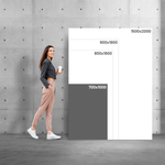

Cut-Out Figures to Bring Your Communication to Life
Perfect for shop windows, events, promotions, or creative parties
Cardboard Silhouettes are ideal for bringing images, characters, or promotional messages to life with visual impact. With custom die-cut shapes and an included stand, they can be easily placed in any indoor space.
Made from 10 mm corrugated cardboard, they are lightweight, durable, and 100% recyclable — a creative and practical way to grab attention.
- Front colour printing
- Custom die-cut shape
- Formats up to 200 cm in height
- Includes rear stand for self-support
- Easy to assemble, transport, and reuse
Cardboard Cutouts (Rigid Media)
Share
Designs
Cardboard Cutouts for fun and creative visual communication
Cardboard Cutouts are perfect for life-sized figures, promotional characters or original decorative elements. Popular at fairs, events, shop windows and parties, they work as eye-catching and imaginative displays. With custom shapes and high-definition printing, these cutouts transform any space with humour, colour and a strong visual presence.
Honeycomb cardboard: lightweight, strong and ready to stand out
Made from 10 mm white honeycomb cardboard, these cutouts provide rigidity, lightness and excellent visual quality. The honeycomb core ensures stability and strength — ideal for large-format figures with self-supporting stands. This material is recyclable, easy to transport and great for temporary displays. The surface allows for vibrant colours and sharp definition, even in creative and custom-cut shapes.
Customise your Cardboard Cutouts with Ask-to-Print’s Online Editor
At Ask-to-Print, you can easily create your custom cutout using the online editor. Upload an image, illustration or character and design the shape to fit. Adjust your layout freely and preview the result in real time before ordering. The cutouts are precision-cut and delivered with a built-in stand, ready to impress.
Buy Cardboard Cutouts with the best value for money
If you’re looking for a cost-effective and original way to highlight your message or image, Cardboard Cutouts are the perfect solution. Lightweight, portable and affordable, they are a low-cost way to bring spaces, events and campaigns to life. Order now and surprise your audience with a bold, personalised cardboard figure that’s easy to set up and visually impactful.
FAQs
Rigid Media
Rigid supports include a wide range of materials such as PVC (Forex®), aluminium (Alucobond®), acrylic (Plexiglas®), corrugated polypropylene (Polionda®), sandwich-type boards (Smart-X®, KAPA®tex), micro-fluted cardboard, pressed cardboard and honeycomb cardboard. Each material is suited to specific needs in visual communication, durability and aesthetics.
The brands mentioned are used as widely recognised market references to help identify the materials. Ask-to-Print may supply equivalent products that offer the same level of quality and technical performance.
Yes. Materials such as aluminium, PVC, corrugated polypropylene and certain sandwich boards (such as Smart-X®) are resistant to humidity, UV rays and temperature variations, making them ideal for long-term outdoor use, including façades, urban signage, advertising panels and real estate signs.
Yes. Most materials allow cutting in straight angles or fully customised shapes. You can create signs with special cut-outs, silhouettes or frames, adapting the design to the layout of your project or exhibition space.
You can choose from classic spacers, repositionable adhesives, double-sided tape, polycarbonate eyelets, or custom-drilled holes for mounting on walls, windows, or display structures. These accessories ensure practical, secure, and aesthetic installation.
Yes. In addition to standard formats, all products can be ordered in custom dimensions, with maximum limits depending on the material. This allows each panel to be perfectly adjusted to your space or mounting structure.
Custom panels, cardboard standees, Photo Booth frames, and hanging signs are ideal for temporary events, as they are lightweight, portable, and easy to set up. PVC or honeycomb cardboard signs are perfect for marking zones, showcasing products, or creating impactful visual dividers.
PVC (Forex®) is a lightweight, durable and versatile material, ideal for signage, advertising panels and indoor applications. Alucobond® is a composite panel made of two thin aluminium sheets bonded to a low-density polyethylene (PE) core. This structure gives it high rigidity, excellent flatness and weather resistance, making it ideal for façades, exterior cladding and visual communication in modern and elegant spaces. Plexiglas® is a translucent acrylic that combines lightness, transparency and strength, making it perfect for decorative panels, partitions and premium signage.
The names Forex®, Alucobond® and Plexiglas® are used here as widely recognised market references to help identify the types of materials described. Products supplied by Ask-to-Print may use these brands or other equivalent alternatives with similar technical quality and characteristics.
Expanded PVC (such as Forex®) is a lightweight, durable material with excellent flatness, ideal for both indoor and outdoor applications. It stands out for its versatility in signage, displays and decorative panels. It allows precise cutting and high-quality printing, making it a balanced solution in terms of performance and cost.
Aluminium composite (such as Alucobond®) offers high structural rigidity, excellent durability and weather resistance, making it ideal for demanding outdoor applications. It is widely used in façades, cladding and premium corporate signage. Its compact composition provides a robust and elegant finish, suitable for businesses seeking a strong and lasting visual presence.
Acrylic (such as Plexiglas®) combines transparency, rigidity and a premium finish, making it a strong alternative to glass with visual and technical advantages. It is suitable for decorative or informative projects, such as elegant signs or design-oriented signage. It can be used both indoors and outdoors, and can be enhanced with frosted films to improve readability and add a refined look.
Corrugated polypropylene (such as Polionda®) is a cost-effective, lightweight and water-resistant option, suitable for temporary indoor or outdoor use. It is particularly effective for seasonal promotional campaigns, outdoor signs and short-term advertising, offering excellent value for fast, high-volume production.
Technical cardboard (such as microfluted, pressed or honeycomb board) is an ecological and creative choice for short-term signage and displays. Lightweight, recyclable and easy to handle, it is ideal for indoor use, promotional stands and sustainable visual communication, with a focus on environmental responsibility.
Cardboard standees are custom-cut printed figures, delivered with a rear support to make them self-standing. They are perfect for promotional events, store windows, trade shows, parties, or photo booths. Made from 10 mm honeycomb cardboard or 4 mm EB-flute board, they combine lightness with structural rigidity, making them easy to transport, assemble, and reuse. They are available in various sizes, up to 200 cm in height, with custom contour cutting to match the image shape.
Silhouettes are produced using precision cutting, based on the vector information included in the final artwork. The shape of the silhouette — whether a figure, object, logo or any other custom outline — must be created as a vector, acting as the cutting path for the machine.
It is essential that this vector is clearly identified in the file (for example, using a spot color named ""CutContour"") and that it is a continuous and closed path. This outline defines exactly where the material will be cut.
To ensure a perfect result and avoid unwanted white edges, the cutting vector should slightly overlap the printed image. Therefore, it is recommended to apply a minimum bleed of 5 mm around the cutting area. This margin allows the background or artwork to extend slightly beyond the cut line, ensuring a seamless and visually clean finish.
This process guarantees a clean and precise cut, fully aligned with the intended design — even for projects with complex shapes or custom outlines.
"PPA, also known as Polionda, is a lightweight, durable and waterproof material, ideal for promotional applications and temporary signage. Its corrugated structure provides rigidity without adding weight, making it easy to transport and install. It is suitable for both indoor and outdoor use, being resistant to moisture, impact and chemical agents. It is a cost-effective and 100% recyclable option, widely used in advertising panels, real estate signs, construction signage and short-term events.
Printing and Production
To ensure a professional result when printing your graphic project, it's essential to follow a series of best practices. The file must be created from scratch using the correct format and dimensions, respecting the technical areas defined for bleed, trim and safety. Below is a full guide to correctly prepare your print-ready file.
1. Start with the correct final size
From the start, define the exact size of the final product. Avoid designing in a different size and adjusting it later. This ensures all elements remain proportional and well positioned, avoiding errors at export or printing stage.
2. Use bleed and safety margins
- Bleed: extend all visual elements at least 2 mm beyond the trim line.
- Trim line: indicates where the product will be physically cut.
- Safety area: keep text and important elements at least 3 mm from the trim line.
- Fold lines: avoid placing text too close to folds. Keep a safe distance from folds for legibility and to avoid distortion.
3. Balance visual hierarchy
Distribute page elements well: maintain good proportion between text, images, and white space. Make sure the content is clear, well-organised and visually harmonious. Overcrowded designs can confuse or impair reading.
4. Choose legible and proportional fonts
- Avoid overly thin or decorative fonts for text blocks.
- Use appropriate font sizes — ideally test with a full-size print to confirm legibility.
- Ensure good contrast between text and background for easier reading.
5. Use images with adequate resolution
- Images should be at least 300 dpi at final print size.
- Avoid using web images, as they usually have low resolution and compromise visual quality. If used, always check the resolution.
- Ensure all images are in CMYK mode. RGB images may shift in colour when printed. Remember, printing is always done in CMYK colour mode.
6. Proofread all text before exporting
- Check for spelling or grammatical errors.
- Verify that all titles, headings and text blocks are correctly aligned and styled.
- When exporting, embed fonts in the PDF or convert them to outlines.
7. Define a consistent visual style
Choose a colour palette, typography and graphic style consistent with your brand or product purpose. A consistent design communicates professionalism and clarity.
8. Use the supplied design template
When using templates from the platform or the free Ask-to-Print Online Editor, place elements according to the guide lines. These lines indicate bleed, trim, fold and safety zones. You can also start your project from scratch in the editor and ensure proper element positioning.
9. Be careful with free online editors
Some online PDF editors don't correctly embed fonts, which can lead to font replacements or display issues. When possible, export the PDF with full font embedding and validate using a professional PDF viewer.
10. Use proper tools to create your design
To properly prepare your file, use the Ask-to-Print Online Editor or professional graphic software that supports technical margin setup and professional formats.
Common professional solutions include Adobe Illustrator, InDesign, Photoshop and CorelDRAW. These programs offer full control over vectors, fonts, bleeds and layers — ideal for advanced graphic production.
For free options, consider Canva (Pro version recommended for export), Inkscape (vector-based) and GIMP (image editing). While less robust, these tools can deliver quality files when used within printing specs.
11. Export correctly to PDF for print
Once your design is finished, export the file as PDF, following these essential requirements to ensure quality and print compatibility:
- Embed all fonts in the final PDF (prevents errors and substitutions).
- Ensure images are CMYK and 300 dpi at final print size.
- Use the PDF/X-1a export profile — ensures compatibility with prepress systems and printing machines.
- Include external bleed and visible trim marks when margin validation is required.
For step-by-step guides on how to export correctly in each program, see our PDF print export FAQ.
Na Ask-to-Print, a verificação do ficheiro depende da opção selecionada no momento da encomenda. Pode escolher entre três níveis de validação, consoante o tipo de apoio que pretende antes de avançar para impressão.
Não Verificar Ficheiro
Ao selecionar esta opção, confirma que o ficheiro enviado está correto, finalizado e pronto para impressão. Neste caso, o ficheiro segue diretamente para produção, sem qualquer verificação técnica prévia. Esta opção não tem custos adicionais.
Verificar Ficheiro
Ao selecionar esta opção, o seu ficheiro será analisado por um profissional antes de seguir para impressão. Se forem identificados erros ou inconformidades, será contactado antes de avançarmos com a produção. Esta opção tem um custo associado.
Verificar e Corrigir
Ao selecionar esta opção, o seu ficheiro será analisado por um profissional antes da impressão. Se forem detetados erros ou inconformidades passíveis de correção técnica, estes serão ajustados antes de o ficheiro seguir para produção. Esta opção tem um custo associado.
Que tipos de erros podem ser verificados?
A verificação pode abranger, entre outros aspetos técnicos, situações como:
- resolução insuficiente de imagens;
- dimensões incorretas do ficheiro;
- ausência de margens de segurança;
- falta de sangramento, bleed ou margem de corte;
- textos ou elementos demasiado próximos da linha de corte;
- utilização de modo de cor incorreto;
- fontes não convertidas em contornos ou não incorporadas;
- elementos em falta ou mal posicionados;
- páginas trocadas ou orientação incorreta;
- linhas de corte, marcas ou outros elementos técnicos indevidos na arte-final.
A análise incide sobretudo sobre a preparação técnica do ficheiro para impressão. Sempre que necessário, e de acordo com a opção escolhida, o cliente será informado ou o ficheiro será corrigido antes da produção.
Importa ainda referir que o serviço de correção não deve ser entendido como um serviço de design gráfico, reformulação criativa ou reconstrução de elementos da arte-final.
At Ask-to-Print, we accept various file formats to ensure the best customization and production experience. However, not all formats offer the same features in the design checking and adjustment process.
See below for file type details:
Files with Preview and Editable Options (recommended and preferred)
- .pdf (Adobe Acrobat)
- .png (PNG Image)
- .jpeg / .jpg (JPEG Image)
- .tiff (TIFF Image)
- .svg (Vector Graphic)
Files with Preview, No Editing Options
- .ai (Adobe Illustrator)
- .eps (PostScript)
- .gif (GIF Image)
Accepted Files, No Preview or Editing Options
- .psd (Adobe Photoshop)
- .cdr (CorelDRAW)
Files Not Accepted by the Platform
- .ppt (Microsoft PowerPoint)
- .doc (Microsoft Word)
- .bmp (Bitmap Image)
Still have questions?
If you're unsure about the correct format or are having trouble uploading your file, our Customer Support team is here to help. Don’t hesitate to contact us — we’ll be happy to assist and ensure your order runs smoothly.
To contact us click here!
When preparing a file for printing, it's essential to understand the difference between the two main colour models used in graphic design: CMYK and RGB. Although both allow for attractive visuals, they serve different purposes and produce different results — especially in print processes.
What are CMYK and RGB colours, and which should I use for printing?
CMYK – The colour model for printing
CMYK stands for Cyan, Magenta, Yellow, and Black. It is the colour model used in all professional printing processes. Colours are created by overlaying percentages of these four inks in layers on the printed surface.
- Used in offset and digital printing.
- Based on subtractive colour from reflected light — unlike screen-emitted light.
- Reproduces a more limited colour gamut, but one suited to the physical printing process.
RGB – Colour model for screens
RGB stands for Red, Green, and Blue. It’s a light-emitting colour model used for displaying colours on digital screens such as monitors, tablets, or smartphones. This model can produce much more vibrant and saturated colours than CMYK.
- Ideal for digital images, videos, and websites.
- Offers a wider colour gamut — meaning it covers more possible colours.
- Colours may appear more intense on screen than what can be printed.
What is colour gamut?
The gamut is the range of colours that a given colour model or device can reproduce. The RGB model has a wider gamut than CMYK, meaning it can display colours that simply cannot be printed with standard inks.
When a file created in RGB is automatically converted to CMYK, colours outside the CMYK gamut are adjusted to approximate values. This can result in noticeable visual differences between what is seen on screen and what gets printed — especially with certain RGB-exclusive or highly vibrant tones.
Which should I use when preparing files for print?
You should always work in CMYK colour mode when creating files intended for print. This ensures that what you see during design stays closer to what can realistically be printed.
If you're using design programs such as Adobe Illustrator, InDesign, or Photoshop, set the colour space to CMYK from the start. On Canva, choose CMYK export (available on the Pro version). This practice prevents colour fidelity loss.
On the Ask-to-Print Online Editor, there’s no need to worry: all files are automatically generated in CMYK with optimised colour management.
Useful tip for professionals and beginners
Even when working in CMYK, differences between screen and print may persist. We recommend using a physical CMYK colour guide to visualise true tonal values before finalising your design. This is especially helpful for branding or colour-critical materials.
Yes. The PDF/X-1a format is accepted by Ask-to-Print and is one of the most recommended options for finalised files. This format ensures that your design is reproduced accurately, preserving embedded fonts, CMYK colours and removing transparencies that may cause printing issues. If your file is production-ready, PDF/X-1a is an excellent choice.
Does Ask-to-Print recommend the PDF/X-1a format?
We strongly recommend using PDF/X-1a whenever uploading a finalised file, especially for technically demanding products such as business cards, flyers or catalogues. This format offers greater compatibility with our production systems and reduces the chance of errors related to fonts, colours or bleed margins.
When should I use the PDF/X-1a format?
PDF/X-1a is ideal for files that require no further editing and are ready for print. If you created your design in software like Adobe Illustrator, InDesign or CorelDRAW and want to preserve the exact layout, this is the safest format. It's especially useful for designs with pure CMYK colours, high-resolution images and where final alignment is crucial.
Does PDF/X-1a guarantee better print quality?
More than quality, PDF/X-1a guarantees consistency and reliability. It prevents issues like font substitution, incorrect colour profiles or unhandled transparencies. The visual quality also depends on resolution and layout, but this format ensures what you see on screen is what gets printed — no surprises.
How can I generate a PDF/X-1a file?
You can generate a PDF/X-1a from programs like Adobe Illustrator, InDesign, Photoshop or CorelDRAW. Just select “Save as PDF” and choose the PDF/X-1a:2001 preset. Make sure to use CMYK colour mode, include 3 mm bleed and convert text to outlines. You can also download our pre-configured templates to simplify the process.
What are the advantages of sending a file in PDF/X-1a?
Better print safety; Preserves fonts, images and colours; Reduces technical error risks; Compatible with prepress systems; Prevents layout surprises. By choosing this format, you're ensuring your file meets best practices in the graphic arts industry.
At Ask-to-Print, you can request a custom cut for various types of products. This cut refers to a shape that differs from the traditional rectangular or square format — such as special contours, curves, interior cutouts or decorative forms.
In the graphic industry, the term custom cut is often referred to as a “die cut” or “cutting line”, and applies both to the traditional blade-based process and to digital cutting (laser or cutting table), which is commonly used for large formats.
How to create a file with a custom cut
If your order includes a custom cut, please prepare your file as follows:
- Create a layer named CutContour.
- Draw the cutting path in the desired shape. The path must be made of continuous and closed vectors.
- Apply a Spot Color named CutContour to the path, using 100% magenta.
- If there are overlapping vectors, make sure they are combined properly.
Important technical rules
- The cutting path must be vector-based — raster images (JPEG, PNG, TIFF) are not valid.
- Ensure the line is closed and has no overlaps.
- Follow the product template guidelines for minimum radii and minimum width of cut areas.
- Avoid overly complex shapes such as tight curves or sharp angles.
- All printable elements must be on a separate layer named Artwork.
- The magenta cutting line will not be printed — it is only a technical reference for the cut.
Bleed and cutting line
To ensure a flawless result and avoid unwanted white edges, the cutting path should slightly overlap the image. Therefore, we recommend applying a minimum bleed of 3 mm for small formats and 5 mm for large formats around the cut area. This ensures the background or image extends beyond the cut line, providing a continuous and clean finish.
Recommended software
To properly prepare the custom cut, use vector illustration software such as Adobe Illustrator, CorelDRAW, InkScape, or other tools compatible with layers and spot colors.
Need help?
If you have any questions or need assistance, our team is always available to help. To check our contact details, click here.
Yes, you can view a proof before printing.
If you use our online editor, you’ll get instant access to a real-time preview of your design, accurately simulating the final result.
If you choose to upload your design or final artwork, you will also be able to preview the job before production — as long as the file is in one of the following formats compatible with digital proofing:
- PDF: Standard format for design previews.
- JPEG and JPG: Image format
- PNG
- GIF: Supported in the proofing process, allowing visual validation before printing.
- Tiff
- AI
- SVG
We accept many other formats, but only these allow automatic job preview generation.
Production Files
A low-resolution file may result in pixelation, lack of sharpness, irregular edges and loss of detail in the final product.
Resolution should always be assessed at the actual production size. Artificially enlarging a small image does not restore the original detail and may further reduce image quality.
Whenever possible, use high-resolution images or vector graphics. Take particular care with images downloaded from the Internet, as they are often optimised for screens and may not have sufficient resolution for graphic production.
When creating a design using very specific fonts or fonts that may not be available in our system, those fonts may be automatically replaced with standard fonts, which can significantly alter the appearance of your printed material.
How does this happen?
If the font used in your design is not embedded in the file or is not a common font recognized by our system, the print software will attempt to replace it with a similar one. However, this substitution may cause your design to lose its original appearance, affecting spacing, formatting and layout.
How to avoid this issue?
To ensure your design prints exactly as intended, follow these steps:
- Embed fonts in the final file: Make sure all fonts used in your project are properly embedded in the design file. This can be done when exporting the file from your design software (such as Illustrator, InDesign, Corel Draw, or others).
- Convert text to outlines: If you can’t embed the fonts, an alternative is to convert the text to outlines (or paths). This transforms the text into vector shapes, eliminating the need for external fonts. Note: This option is not recommended for products like Books, Magazines or Catalogues, as outlined text cannot be edited later.
- Check fonts and images in your file: Graphic design software such as Illustrator offers tools to ensure everything is correct before sending your file to print. One way to do this is to generate a final report that lists all fonts used and includes details about images, such as whether they are in CMYK or RGB mode (remember that for printing, images must be in CMYK).
- To generate the report in Illustrator:
- Go to the “File” menu >“Package”.
- In the Package options panel, check the boxes to include fonts and images.
- Illustrator will create a folder with all your project files, including embedded fonts, images (with CMYK or RGB info), and other essential details.
- To generate the report in Illustrator:
- Use the Illustrator Package feature: This is ideal to ensure that all resources required for your project are properly delivered. The Package generates a folder containing all design elements (fonts, images, colours, and more), making it easier to review everything.
Summary
To avoid font issues and ensure your design prints exactly as intended, embed fonts or convert them to outlines.
Embedding fonts in a PDF is essential to ensure the file is viewed and printed correctly on devices that may not have the same fonts installed. This practice is especially important in web-to-print environments, where files are prepared by end users and sent directly to print production.
What does embedding fonts mean?
When you embed fonts in a PDF file, the font data is included directly within the document. This preserves the text’s appearance, even if the PDF is opened on different computers, using different systems or without the original fonts installed.
How to embed fonts – General Steps
Adobe InDesign, Illustrator and Photoshop
- Go to File > Export and choose the Adobe PDF format.
- Access the Advanced tab.
- Enable the option Embed All Fonts or Subset fonts below 100%.
- Select a profile like PDF/X-1a or PDF/X-4, suitable for professional printing.
CorelDRAW
- Go to File > Export > PDF.
- In the Advanced tab, select Embed All Fonts.
Other programs (Affinity Designer, Canva, Inkscape, GIMP, etc.)
- Most export to PDF with fonts embedded by default.
- Always check export options for terms like "embed fonts" or "PDF/X compliance".
Best Practices for Web-to-Print
- Converting text to outlines is a safe option if the file doesn’t need further editing.
- Only use licensed fonts to avoid embedding restrictions.
- Avoid online fonts from cloud editors that don’t allow embedding.
What is rich black and when should it be used?
In graphic design for print, there are two main ways to apply black: plain black (100% K) and rich black. While both may look the same on screen, the printed result can differ significantly depending on the method used.
Plain black (100% K)
Plain black uses only black ink (K = 100%) in the CMYK model. It is ideal for text and fine elements, ensuring clarity, readability and no registration issues. However, when used in large solid areas (e.g., backgrounds), it may appear dull or greyish, as it relies on a single layer of ink.
Rich black – Greater intensity and depth
Rich black is created by combining black ink with controlled amounts of cyan, magenta and yellow (CMY). This blend enhances visual density and results in a deeper, more even black. It is especially effective for dark backgrounds, large blocks or visually impactful elements.
A safe and commonly used rich black formula is:
- C: 60%
- M: 40%
- Y: 40%
- K: 100%
These percentages may vary slightly depending on the paper type and print profile, but total ink coverage must always be respected.
Best practices when using rich black
- Use plain black (100% K) for text, fine lines and small elements — avoids registration issues.
- Use rich black for large areas, dark backgrounds or impactful visuals.
- Avoid using 100% for all colours (C+M+Y+K), as it may cause ink overload and drying issues — use our recommended formula instead.
Artwork – Large Format Printing
To ensure a professional result in Large Format Printing, the file must be prepared according to the final size, viewing distance, selected material and finishing options. Production is carried out through digital printing and may involve cutting, bleed, hems, eyelets, pockets, mounting systems or splitting the artwork into multiple panels. Below is a complete guide to correctly prepare your artwork file.
1. Start with the correct final format and scale
Prepare the document at a 1:1 scale whenever possible, meaning the actual production size. Working at the final size allows you to correctly evaluate image resolution, text size, margins and the positioning of all elements.
- 1:1 scale: a file for an 80 × 200 cm support should be created at 80 × 200 cm.
- Reduced scale: if the software does not allow working at the final size, you can use a proportional scale, such as 1:10. The scale must be clearly identified and applied consistently throughout the document.
- Resolution at scale: in a 1:10 document, images must have ten times the resolution required at the final size. For example, 150 dpi at final size corresponds to 1500 dpi in a 1:10 file.
Important: never simply increase the document size during export. Changing the scale may affect effective resolution, margins, line thicknesses and element positioning.
2. Respect bleed, margins and finishing requirements
Technical requirements vary depending on the product and finishing options. Always use the provided design template and confirm the specific instructions before starting the artwork.
- Bleed: extend backgrounds and images beyond the final format according to the measurement indicated for the product or design guide (template).
- Safety area: keep text, logos and important information away from edges and finishing areas.
- Hems, eyelets and pockets: do not place important elements in areas reserved for reinforcement, stitching, eyelets, rods or structures.
- Custom cutting: when a custom shape is required, follow the cutting line and the technical clearances indicated.
- Panel splitting: for very large projects, such as XL posters, billboards or large banners, production may require several panels. In these cases, artwork continuity must be ensured and overlap areas between panels must be considered. Submit the design at the correct size and format; panel division and overlap margins will be defined by Ask-to-Print production.
3. Design: readability, hierarchy and viewing distance
Large Format work is usually viewed from a greater distance than flyers or business cards. Organise information by importance and ensure the main message can be understood quickly.
- Use titles, images and text sizes suitable for the viewing distance.
- Avoid excessive text and elements placed too close together.
- Ensure sufficient contrast between text, images and background.
- Evaluate the design at scale and, whenever possible, review it from the intended viewing distance.
4. Keep text, logos and shapes as vectors
Whenever possible, keep logos, text, icons, lines and geometric shapes in vector format. Vector elements can be enlarged without losing definition and create lighter files than large raster images.
- Avoid rasterising text and logos unnecessarily.
- Use line thicknesses and font sizes suitable for the final size.
- Convert all text into vectors, outlines or paths before exporting.
Important: keep an editable copy before converting text. After conversion, the content can no longer be edited as text.
5. Use the correct resolution at final size
In Large Format Printing, 300 dpi is not required for every project. Files larger than A2 can generally be prepared, as a reference, between 150 and 180 dpi at final size. This balances quality, file size and digital printing efficiency.
- Up to A2 or close viewing distance: preferably use 300 dpi, especially for photographs, small text or fine details.
- Above A2: normally use between 150 and 180 dpi at final size.
- Very large formats viewed from a distance: may allow lower resolutions if indicated for the product or previously validated.
Essential rule: resolution must always be evaluated at the final print size. The value shown by the software is only valid when it corresponds to the actual pixel information of the image at the size it will be printed.
6. Do not confuse effective resolution with interpolation
Changing an image from 72 to 150 dpi does not automatically create real detail. If the software adds pixels through interpolation, the file becomes larger, but the original image still has limited information and may remain blurred or pixelated.
- Effective resolution: the resolution the image has when placed at the actual size it will be printed.
- Interpolation: the artificial creation of new pixels by software. It can smooth an image but cannot recover missing details.
- Scaling: increasing image size reduces effective resolution. Doubling the size reduces resolution by half.
- Internet images: may have 72 dpi and insufficient pixel dimensions. Do not judge quality only by screen appearance.
Example: a 72 dpi image enlarged to fill a roll-up does not become suitable quality simply by exporting it at 150 dpi. The image must contain enough pixels to achieve the recommended resolution at final size.
Ready to create your product design?
To get started, select the product size, review the design instructions, download them for reference and continue to the customisation options.


