
- Home
- Promotional Products
- Writing
- Soft Touch Aluminium Pen POPPINS


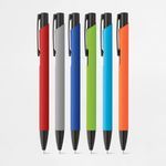
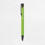
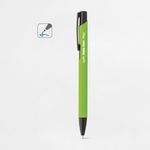
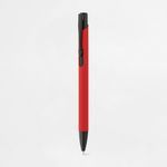
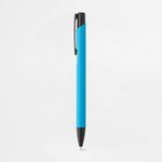
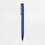
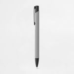
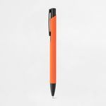
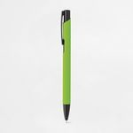

Soft Touch aluminium ball pen
The POPPINS Soft Touch Aluminium Pen combines elegance, comfort and durability in a premium writing instrument. Manufactured from lightweight aluminium, it features a smooth Soft Touch rubber finish that provides a comfortable grip and an enjoyable writing experience. Its coloured barrel gives the pen a modern and professional appearance, making it ideal for everyday use as well as promotional campaigns.
- Lightweight and durable aluminium barrel
- Soft Touch rubber finish
- Blue ink
- Twist-action mechanism
Reference: 81140
How would you like to create your design?
In the next step, choose how you would like to handle your design.
To keep your estimated delivery date, complete your order by .
Premium comfort for everyday writing
The POPPINS Soft Touch Aluminium Pen has been designed to deliver a comfortable and enjoyable writing experience throughout the day. Its lightweight aluminium barrel offers excellent durability, while the Soft Touch coating provides a smooth, velvety feel that improves grip and writing comfort. Whether used in the office, at school, during meetings or at events, this pen offers reliable performance combined with an elegant appearance.
Modern design with practical functionality
Featuring clean lines and a contemporary finish, the POPPINS pen is suitable for any professional or personal environment. The twist-action mechanism allows quick and effortless operation while protecting the writing tip when not in use. Filled with blue ink, it delivers smooth and consistent writing, making it perfect for everyday note-taking, signatures and business documents.
An excellent promotional giveaway
The premium Soft Touch finish gives this aluminium pen a high perceived value, making it an ideal promotional gift for companies looking to enhance their brand image. Its aluminium barrel provides an excellent surface for laser engraving or printing, allowing logos and corporate messages to stand out with a professional finish. It is a perfect choice for trade shows, conferences, corporate events, educational institutions, hotels and marketing campaigns.
Built to represent your brand
Unlike standard plastic pens, the POPPINS offers greater durability and a noticeably superior writing experience. The aluminium construction ensures long-lasting performance, while the Soft Touch finish creates a premium feel that recipients appreciate and continue to use. As a result, your brand benefits from increased visibility every time the pen is used.
Order the POPPINS Soft Touch Aluminium Pen at the best price
An affordable solution for high-quality promotional campaigns. This cost-effective promotional pen combines elegant design, excellent writing comfort and long-lasting durability. An ideal choice for businesses looking to offer a practical, stylish and professional promotional gift that keeps their brand visible every day.
FAQs
Writing
Eco-friendly pens are typically made from sustainable materials such as bamboo, cork, kraft paper, recycled ABS (rABS), wheat straw fiber, or recycled cardboard, helping to reduce environmental impact.
Yes, many metal pen models have finishes suitable for laser engraving, creating an elegant contrast — especially those with matte or dual-finish surfaces.
Although made from natural or recycled materials, eco-friendly pens are designed to ensure good durability and performance, both in writing and structure.
Yes. Most models can be customized on the barrel, clip, or top using pad printing, screen printing, or laser engraving (for metal pens).
Twist pens operate by rotating the barrel to expose or retract the tip, while capped pens require removing the cap manually. The twist mechanism is more practical in professional environments.
Pens usually write in blue or black ink. Pencils are typically HB grade, and highlighters are available in fluorescent colors such as yellow, pink, and green.
Sets may include combinations such as a ballpoint pen with a rollerball, pencil, mechanical pencil, or accessories like erasers, sharpeners, rulers, and cases. They are ideal for corporate or school gifts.
It’s a pen with multiple ink refills (usually blue, red, green, and black) in a single barrel. You can switch colors with a simple click — ideal for organizing tasks or studying.
Pencils with erasers are more practical for school or casual use, allowing easy corrections. Those without erasers are often preferred in professional settings or for a more classic appearance.
Yes, several models feature a touch-screen-compatible tip, perfect for switching between paper and digital devices with ease.
Many models come in cases, kraft paper boxes, or cork pouches — especially writing sets or premium models.
rABS and rPET refer to recycled ABS and PET plastics. These are reused plastics that maintain strength and quality, used in eco-friendly products to reduce environmental impact.
These pens feature a body made from recycled paper, often combined with recycled plastic components. They offer a lightweight and sustainable choice for everyday writing.
Printing and Production
To ensure a professional result when printing your graphic project, it's essential to follow a series of best practices. The file must be created from scratch using the correct format and dimensions, respecting the technical areas defined for bleed, trim and safety. Below is a full guide to correctly prepare your print-ready file.
1. Start with the correct final size
From the start, define the exact size of the final product. Avoid designing in a different size and adjusting it later. This ensures all elements remain proportional and well positioned, avoiding errors at export or printing stage.
2. Use bleed and safety margins
- Bleed: extend all visual elements at least 2 mm beyond the trim line.
- Trim line: indicates where the product will be physically cut.
- Safety area: keep text and important elements at least 3 mm from the trim line.
- Fold lines: avoid placing text too close to folds. Keep a safe distance from folds for legibility and to avoid distortion.
3. Balance visual hierarchy
Distribute page elements well: maintain good proportion between text, images, and white space. Make sure the content is clear, well-organised and visually harmonious. Overcrowded designs can confuse or impair reading.
4. Choose legible and proportional fonts
- Avoid overly thin or decorative fonts for text blocks.
- Use appropriate font sizes — ideally test with a full-size print to confirm legibility.
- Ensure good contrast between text and background for easier reading.
5. Use images with adequate resolution
- Images should be at least 300 dpi at final print size.
- Avoid using web images, as they usually have low resolution and compromise visual quality. If used, always check the resolution.
- Ensure all images are in CMYK mode. RGB images may shift in colour when printed. Remember, printing is always done in CMYK colour mode.
6. Proofread all text before exporting
- Check for spelling or grammatical errors.
- Verify that all titles, headings and text blocks are correctly aligned and styled.
- When exporting, embed fonts in the PDF or convert them to outlines.
7. Define a consistent visual style
Choose a colour palette, typography and graphic style consistent with your brand or product purpose. A consistent design communicates professionalism and clarity.
8. Use the supplied design template
When using templates from the platform or the free Ask-to-Print Online Editor, place elements according to the guide lines. These lines indicate bleed, trim, fold and safety zones. You can also start your project from scratch in the editor and ensure proper element positioning.
9. Be careful with free online editors
Some online PDF editors don't correctly embed fonts, which can lead to font replacements or display issues. When possible, export the PDF with full font embedding and validate using a professional PDF viewer.
10. Use proper tools to create your design
To properly prepare your file, use the Ask-to-Print Online Editor or professional graphic software that supports technical margin setup and professional formats.
Common professional solutions include Adobe Illustrator, InDesign, Photoshop and CorelDRAW. These programs offer full control over vectors, fonts, bleeds and layers — ideal for advanced graphic production.
For free options, consider Canva (Pro version recommended for export), Inkscape (vector-based) and GIMP (image editing). While less robust, these tools can deliver quality files when used within printing specs.
11. Export correctly to PDF for print
Once your design is finished, export the file as PDF, following these essential requirements to ensure quality and print compatibility:
- Embed all fonts in the final PDF (prevents errors and substitutions).
- Ensure images are CMYK and 300 dpi at final print size.
- Use the PDF/X-1a export profile — ensures compatibility with prepress systems and printing machines.
- Include external bleed and visible trim marks when margin validation is required.
For step-by-step guides on how to export correctly in each program, see our PDF print export FAQ.
Na Ask-to-Print, a verificação do ficheiro depende da opção selecionada no momento da encomenda. Pode escolher entre três níveis de validação, consoante o tipo de apoio que pretende antes de avançar para impressão.
Não Verificar Ficheiro
Ao selecionar esta opção, confirma que o ficheiro enviado está correto, finalizado e pronto para impressão. Neste caso, o ficheiro segue diretamente para produção, sem qualquer verificação técnica prévia. Esta opção não tem custos adicionais.
Verificar Ficheiro
Ao selecionar esta opção, o seu ficheiro será analisado por um profissional antes de seguir para impressão. Se forem identificados erros ou inconformidades, será contactado antes de avançarmos com a produção. Esta opção tem um custo associado.
Verificar e Corrigir
Ao selecionar esta opção, o seu ficheiro será analisado por um profissional antes da impressão. Se forem detetados erros ou inconformidades passíveis de correção técnica, estes serão ajustados antes de o ficheiro seguir para produção. Esta opção tem um custo associado.
Que tipos de erros podem ser verificados?
A verificação pode abranger, entre outros aspetos técnicos, situações como:
- resolução insuficiente de imagens;
- dimensões incorretas do ficheiro;
- ausência de margens de segurança;
- falta de sangramento, bleed ou margem de corte;
- textos ou elementos demasiado próximos da linha de corte;
- utilização de modo de cor incorreto;
- fontes não convertidas em contornos ou não incorporadas;
- elementos em falta ou mal posicionados;
- páginas trocadas ou orientação incorreta;
- linhas de corte, marcas ou outros elementos técnicos indevidos na arte-final.
A análise incide sobretudo sobre a preparação técnica do ficheiro para impressão. Sempre que necessário, e de acordo com a opção escolhida, o cliente será informado ou o ficheiro será corrigido antes da produção.
Importa ainda referir que o serviço de correção não deve ser entendido como um serviço de design gráfico, reformulação criativa ou reconstrução de elementos da arte-final.
At Ask-to-Print, we accept various file formats to ensure the best customization and production experience. However, not all formats offer the same features in the design checking and adjustment process.
See below for file type details:
Files with Preview and Editable Options (recommended and preferred)
- .pdf (Adobe Acrobat)
- .png (PNG Image)
- .jpeg / .jpg (JPEG Image)
- .tiff (TIFF Image)
- .svg (Vector Graphic)
Files with Preview, No Editing Options
- .ai (Adobe Illustrator)
- .eps (PostScript)
- .gif (GIF Image)
Accepted Files, No Preview or Editing Options
- .psd (Adobe Photoshop)
- .cdr (CorelDRAW)
Files Not Accepted by the Platform
- .ppt (Microsoft PowerPoint)
- .doc (Microsoft Word)
- .bmp (Bitmap Image)
Still have questions?
If you're unsure about the correct format or are having trouble uploading your file, our Customer Support team is here to help. Don’t hesitate to contact us — we’ll be happy to assist and ensure your order runs smoothly.
To contact us click here!
When preparing a file for printing, it's essential to understand the difference between the two main colour models used in graphic design: CMYK and RGB. Although both allow for attractive visuals, they serve different purposes and produce different results — especially in print processes.
What are CMYK and RGB colours, and which should I use for printing?
CMYK – The colour model for printing
CMYK stands for Cyan, Magenta, Yellow, and Black. It is the colour model used in all professional printing processes. Colours are created by overlaying percentages of these four inks in layers on the printed surface.
- Used in offset and digital printing.
- Based on subtractive colour from reflected light — unlike screen-emitted light.
- Reproduces a more limited colour gamut, but one suited to the physical printing process.
RGB – Colour model for screens
RGB stands for Red, Green, and Blue. It’s a light-emitting colour model used for displaying colours on digital screens such as monitors, tablets, or smartphones. This model can produce much more vibrant and saturated colours than CMYK.
- Ideal for digital images, videos, and websites.
- Offers a wider colour gamut — meaning it covers more possible colours.
- Colours may appear more intense on screen than what can be printed.
What is colour gamut?
The gamut is the range of colours that a given colour model or device can reproduce. The RGB model has a wider gamut than CMYK, meaning it can display colours that simply cannot be printed with standard inks.
When a file created in RGB is automatically converted to CMYK, colours outside the CMYK gamut are adjusted to approximate values. This can result in noticeable visual differences between what is seen on screen and what gets printed — especially with certain RGB-exclusive or highly vibrant tones.
Which should I use when preparing files for print?
You should always work in CMYK colour mode when creating files intended for print. This ensures that what you see during design stays closer to what can realistically be printed.
If you're using design programs such as Adobe Illustrator, InDesign, or Photoshop, set the colour space to CMYK from the start. On Canva, choose CMYK export (available on the Pro version). This practice prevents colour fidelity loss.
On the Ask-to-Print Online Editor, there’s no need to worry: all files are automatically generated in CMYK with optimised colour management.
Useful tip for professionals and beginners
Even when working in CMYK, differences between screen and print may persist. We recommend using a physical CMYK colour guide to visualise true tonal values before finalising your design. This is especially helpful for branding or colour-critical materials.
Yes. The PDF/X-1a format is accepted by Ask-to-Print and is one of the most recommended options for finalised files. This format ensures that your design is reproduced accurately, preserving embedded fonts, CMYK colours and removing transparencies that may cause printing issues. If your file is production-ready, PDF/X-1a is an excellent choice.
Does Ask-to-Print recommend the PDF/X-1a format?
We strongly recommend using PDF/X-1a whenever uploading a finalised file, especially for technically demanding products such as business cards, flyers or catalogues. This format offers greater compatibility with our production systems and reduces the chance of errors related to fonts, colours or bleed margins.
When should I use the PDF/X-1a format?
PDF/X-1a is ideal for files that require no further editing and are ready for print. If you created your design in software like Adobe Illustrator, InDesign or CorelDRAW and want to preserve the exact layout, this is the safest format. It's especially useful for designs with pure CMYK colours, high-resolution images and where final alignment is crucial.
Does PDF/X-1a guarantee better print quality?
More than quality, PDF/X-1a guarantees consistency and reliability. It prevents issues like font substitution, incorrect colour profiles or unhandled transparencies. The visual quality also depends on resolution and layout, but this format ensures what you see on screen is what gets printed — no surprises.
How can I generate a PDF/X-1a file?
You can generate a PDF/X-1a from programs like Adobe Illustrator, InDesign, Photoshop or CorelDRAW. Just select “Save as PDF” and choose the PDF/X-1a:2001 preset. Make sure to use CMYK colour mode, include 3 mm bleed and convert text to outlines. You can also download our pre-configured templates to simplify the process.
What are the advantages of sending a file in PDF/X-1a?
Better print safety; Preserves fonts, images and colours; Reduces technical error risks; Compatible with prepress systems; Prevents layout surprises. By choosing this format, you're ensuring your file meets best practices in the graphic arts industry.
At Ask-to-Print, you can request a custom cut for various types of products. This cut refers to a shape that differs from the traditional rectangular or square format — such as special contours, curves, interior cutouts or decorative forms.
In the graphic industry, the term custom cut is often referred to as a “die cut” or “cutting line”, and applies both to the traditional blade-based process and to digital cutting (laser or cutting table), which is commonly used for large formats.
How to create a file with a custom cut
If your order includes a custom cut, please prepare your file as follows:
- Create a layer named CutContour.
- Draw the cutting path in the desired shape. The path must be made of continuous and closed vectors.
- Apply a Spot Color named CutContour to the path, using 100% magenta.
- If there are overlapping vectors, make sure they are combined properly.
Important technical rules
- The cutting path must be vector-based — raster images (JPEG, PNG, TIFF) are not valid.
- Ensure the line is closed and has no overlaps.
- Follow the product template guidelines for minimum radii and minimum width of cut areas.
- Avoid overly complex shapes such as tight curves or sharp angles.
- All printable elements must be on a separate layer named Artwork.
- The magenta cutting line will not be printed — it is only a technical reference for the cut.
Bleed and cutting line
To ensure a flawless result and avoid unwanted white edges, the cutting path should slightly overlap the image. Therefore, we recommend applying a minimum bleed of 3 mm for small formats and 5 mm for large formats around the cut area. This ensures the background or image extends beyond the cut line, providing a continuous and clean finish.
Recommended software
To properly prepare the custom cut, use vector illustration software such as Adobe Illustrator, CorelDRAW, InkScape, or other tools compatible with layers and spot colors.
Need help?
If you have any questions or need assistance, our team is always available to help. To check our contact details, click here.
Yes, you can view a proof before printing.
If you use our online editor, you’ll get instant access to a real-time preview of your design, accurately simulating the final result.
If you choose to upload your design or final artwork, you will also be able to preview the job before production — as long as the file is in one of the following formats compatible with digital proofing:
- PDF: Standard format for design previews.
- JPEG and JPG: Image format
- PNG
- GIF: Supported in the proofing process, allowing visual validation before printing.
- Tiff
- AI
- SVG
We accept many other formats, but only these allow automatic job preview generation.
Production Files
A low-resolution file may result in pixelation, lack of sharpness, irregular edges and loss of detail in the final product.
Resolution should always be assessed at the actual production size. Artificially enlarging a small image does not restore the original detail and may further reduce image quality.
Whenever possible, use high-resolution images or vector graphics. Take particular care with images downloaded from the Internet, as they are often optimised for screens and may not have sufficient resolution for graphic production.
When creating a design using very specific fonts or fonts that may not be available in our system, those fonts may be automatically replaced with standard fonts, which can significantly alter the appearance of your printed material.
How does this happen?
If the font used in your design is not embedded in the file or is not a common font recognized by our system, the print software will attempt to replace it with a similar one. However, this substitution may cause your design to lose its original appearance, affecting spacing, formatting and layout.
How to avoid this issue?
To ensure your design prints exactly as intended, follow these steps:
- Embed fonts in the final file: Make sure all fonts used in your project are properly embedded in the design file. This can be done when exporting the file from your design software (such as Illustrator, InDesign, Corel Draw, or others).
- Convert text to outlines: If you can’t embed the fonts, an alternative is to convert the text to outlines (or paths). This transforms the text into vector shapes, eliminating the need for external fonts. Note: This option is not recommended for products like Books, Magazines or Catalogues, as outlined text cannot be edited later.
- Check fonts and images in your file: Graphic design software such as Illustrator offers tools to ensure everything is correct before sending your file to print. One way to do this is to generate a final report that lists all fonts used and includes details about images, such as whether they are in CMYK or RGB mode (remember that for printing, images must be in CMYK).
- To generate the report in Illustrator:
- Go to the “File” menu >“Package”.
- In the Package options panel, check the boxes to include fonts and images.
- Illustrator will create a folder with all your project files, including embedded fonts, images (with CMYK or RGB info), and other essential details.
- To generate the report in Illustrator:
- Use the Illustrator Package feature: This is ideal to ensure that all resources required for your project are properly delivered. The Package generates a folder containing all design elements (fonts, images, colours, and more), making it easier to review everything.
Summary
To avoid font issues and ensure your design prints exactly as intended, embed fonts or convert them to outlines.
Embedding fonts in a PDF is essential to ensure the file is viewed and printed correctly on devices that may not have the same fonts installed. This practice is especially important in web-to-print environments, where files are prepared by end users and sent directly to print production.
What does embedding fonts mean?
When you embed fonts in a PDF file, the font data is included directly within the document. This preserves the text’s appearance, even if the PDF is opened on different computers, using different systems or without the original fonts installed.
How to embed fonts – General Steps
Adobe InDesign, Illustrator and Photoshop
- Go to File > Export and choose the Adobe PDF format.
- Access the Advanced tab.
- Enable the option Embed All Fonts or Subset fonts below 100%.
- Select a profile like PDF/X-1a or PDF/X-4, suitable for professional printing.
CorelDRAW
- Go to File > Export > PDF.
- In the Advanced tab, select Embed All Fonts.
Other programs (Affinity Designer, Canva, Inkscape, GIMP, etc.)
- Most export to PDF with fonts embedded by default.
- Always check export options for terms like "embed fonts" or "PDF/X compliance".
Best Practices for Web-to-Print
- Converting text to outlines is a safe option if the file doesn’t need further editing.
- Only use licensed fonts to avoid embedding restrictions.
- Avoid online fonts from cloud editors that don’t allow embedding.
What is rich black and when should it be used?
In graphic design for print, there are two main ways to apply black: plain black (100% K) and rich black. While both may look the same on screen, the printed result can differ significantly depending on the method used.
Plain black (100% K)
Plain black uses only black ink (K = 100%) in the CMYK model. It is ideal for text and fine elements, ensuring clarity, readability and no registration issues. However, when used in large solid areas (e.g., backgrounds), it may appear dull or greyish, as it relies on a single layer of ink.
Rich black – Greater intensity and depth
Rich black is created by combining black ink with controlled amounts of cyan, magenta and yellow (CMY). This blend enhances visual density and results in a deeper, more even black. It is especially effective for dark backgrounds, large blocks or visually impactful elements.
A safe and commonly used rich black formula is:
- C: 60%
- M: 40%
- Y: 40%
- K: 100%
These percentages may vary slightly depending on the paper type and print profile, but total ink coverage must always be respected.
Best practices when using rich black
- Use plain black (100% K) for text, fine lines and small elements — avoids registration issues.
- Use rich black for large areas, dark backgrounds or impactful visuals.
- Avoid using 100% for all colours (C+M+Y+K), as it may cause ink overload and drying issues — use our recommended formula instead.



Didn’t find exactly what you’re looking for?
If you need a specific solution or features not available on the website, our team is here to help. We analyse your request and recommend the best options in terms of materials, formats, finishes and production.
We develop tailored solutions to match your project needs.


