



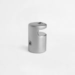

Robust side fixing with elegant finish
Secure and discreet support for panel mounting
The Lateral Standoff Fixing in aluminum is the ideal choice to ensure stability and a professional look in panel installations. With dimensions of 25 x 37 mm and a satin silver finish, it offers durability, elegance, and a perfect fit for different materials, creating a safe and sophisticated installation.
- Dimension 25 x 37 mm | Weight: 90 g per unit
- Made of aluminum with satin silver finish
- Compatible with various types of materials
- Supports panels up to 8 mm thick
- Discreet, secure side fixing with a minimalist look
Ref.: FXFDLSPS2537-04
Side Panel Spacer (Accessories)
Share
Customise & Estimate


Side mounting with floating effect and maximum stability
Transform any panel into a suspended display with this simple side spacer that creates an elegant and modern gap between the wall and the mounted piece. Perfect for signage, décor, or exhibition projects, this accessory ensures a floating, safe, and sophisticated appearance—ideal for enhancing any displayed content.
Aluminum design with satin silver finish and premium look
The spacer is made of durable aluminum with a satin silver finish, delivering a refined and professional touch. This finish not only enhances the overall installation aesthetics but also minimizes unwanted reflections in well-lit environments. A piece that balances durability with modern design.
Compatible with multiple panel types and settings
This side spacer works with acrylic, tempered glass, PVC, wood, and other rigid materials. Its installation is quick and secure, making it ideal for galleries, receptions, stores, offices, or promotional stands. A versatile accessory designed to suit a range of applications and visual needs.
Buy Side Panel Spacer with the best quality-to-price ratio
This part is an economical choice for demanding professionals. With its minimalist yet effective design, it provides a low-cost solution with solid performance and attractive aesthetics. If you're looking for a budget-friendly yet high-quality spacer, this is the right option. Order now from Ask-to-Print and enhance your installations with functional elegance.
FAQs
Posters
Blueback paper has a blue reverse side, ideal for pasting over old posters without transparency issues. It is resistant to light and moisture. Whiteback paper has a white reverse side and is better suited for indoor applications where opacity is not required.
Accessories
The round metal base with a scratch-resistant finish is ideal for indoor use. Compatible with various flag models, it provides stability and includes a transport bag for easy handling.
For outdoor use, a water-fillable or car wheel base is recommended. The water base can be filled with water or sand for extra stability, while the wheel base is practical for frequent repositioning.
Yes. The iron ground spike is ideal for securing flags on soft surfaces like grass or soil. It is easy to apply, requires no tools, and offers excellent stability outdoors.
There are steel or aluminum stands that support rigid graphics up to 26 mm thick. These models are sturdy, stable, and ideal for exhibitions, retail environments, or high-traffic commercial spaces.
The felt-edge squeegee is the ideal tool for applying vinyl without scratching the surface. It is perfect for vehicle graphics and large-format installations, helping to eliminate bubbles and ensure a smooth finish.
Yes. Customizable tablecloths are made from durable polyester and available in rectangular and circular formats. They are perfect for showcasing your brand’s visual identity at trade shows and promotional events.
Printing and Production
At Ask-to-Print, we accept various file formats to ensure the best customization and production experience. However, not all formats offer the same features in the design checking and adjustment process.
See below for file type details:
Files with Preview and Editable Options (recommended and preferred)
- .pdf (Adobe Acrobat)
- .png (PNG Image)
- .jpeg / .jpg (JPEG Image)
- .tiff (TIFF Image)
- .svg (Vector Graphic)
Files with Preview, No Editing Options
- .ai (Adobe Illustrator)
- .eps (PostScript)
- .gif (GIF Image)
Accepted Files, No Preview or Editing Options
- .psd (Adobe Photoshop)
- .cdr (CorelDRAW)
Files Not Accepted by the Platform
- .ppt (Microsoft PowerPoint)
- .doc (Microsoft Word)
- .bmp (Bitmap Image)
Still have questions?
If you're unsure about the correct format or are having trouble uploading your file, our Customer Support team is here to help. Don’t hesitate to contact us — we’ll be happy to assist and ensure your order runs smoothly.
To contact us click here!
When preparing a file for printing, it's essential to understand the difference between the two main colour models used in graphic design: CMYK and RGB. Although both allow for attractive visuals, they serve different purposes and produce different results — especially in print processes.
What are CMYK and RGB colours, and which should I use for printing?
CMYK – The colour model for printing
CMYK stands for Cyan, Magenta, Yellow, and Black. It is the colour model used in all professional printing processes. Colours are created by overlaying percentages of these four inks in layers on the printed surface.
- Used in offset and digital printing.
- Based on subtractive colour from reflected light — unlike screen-emitted light.
- Reproduces a more limited colour gamut, but one suited to the physical printing process.
RGB – Colour model for screens
RGB stands for Red, Green, and Blue. It’s a light-emitting colour model used for displaying colours on digital screens such as monitors, tablets, or smartphones. This model can produce much more vibrant and saturated colours than CMYK.
- Ideal for digital images, videos, and websites.
- Offers a wider colour gamut — meaning it covers more possible colours.
- Colours may appear more intense on screen than what can be printed.
What is colour gamut?
The gamut is the range of colours that a given colour model or device can reproduce. The RGB model has a wider gamut than CMYK, meaning it can display colours that simply cannot be printed with standard inks.
When a file created in RGB is automatically converted to CMYK, colours outside the CMYK gamut are adjusted to approximate values. This can result in noticeable visual differences between what is seen on screen and what gets printed — especially with certain RGB-exclusive or highly vibrant tones.
Which should I use when preparing files for print?
You should always work in CMYK colour mode when creating files intended for print. This ensures that what you see during design stays closer to what can realistically be printed.
If you're using design programs such as Adobe Illustrator, InDesign, or Photoshop, set the colour space to CMYK from the start. On Canva, choose CMYK export (available on the Pro version). This practice prevents colour fidelity loss.
On the Ask-to-Print Online Editor, there’s no need to worry: all files are automatically generated in CMYK with optimised colour management.
Useful tip for professionals and beginners
Even when working in CMYK, differences between screen and print may persist. We recommend using a physical CMYK colour guide to visualise true tonal values before finalising your design. This is especially helpful for branding or colour-critical materials.
Yes, you can view a proof before printing.
If you use our online editor, you’ll get instant access to a real-time preview of your design, accurately simulating the final result.
If you choose to upload your design or final artwork, you will also be able to preview the job before production — as long as the file is in one of the following formats compatible with digital proofing:
- PDF: Standard format for design previews.
- JPEG and JPG: Image format
- PNG
- GIF: Supported in the proofing process, allowing visual validation before printing.
- Tiff
- AI
- SVG
We accept many other formats, but only these allow automatic job preview generation.
Production Files
A low-resolution file may result in pixelation, lack of sharpness, irregular edges and loss of detail in the final product.
Resolution should always be assessed at the actual production size. Artificially enlarging a small image does not restore the original detail and may further reduce image quality.
Whenever possible, use high-resolution images or vector graphics. Take particular care with images downloaded from the Internet, as they are often optimised for screens and may not have sufficient resolution for graphic production.
When creating a design using very specific fonts or fonts that may not be available in our system, those fonts may be automatically replaced with standard fonts, which can significantly alter the appearance of your printed material.
How does this happen?
If the font used in your design is not embedded in the file or is not a common font recognized by our system, the print software will attempt to replace it with a similar one. However, this substitution may cause your design to lose its original appearance, affecting spacing, formatting and layout.
How to avoid this issue?
To ensure your design prints exactly as intended, follow these steps:
- Embed fonts in the final file: Make sure all fonts used in your project are properly embedded in the design file. This can be done when exporting the file from your design software (such as Illustrator, InDesign, Corel Draw, or others).
- Convert text to outlines: If you can’t embed the fonts, an alternative is to convert the text to outlines (or paths). This transforms the text into vector shapes, eliminating the need for external fonts. Note: This option is not recommended for products like Books, Magazines or Catalogues, as outlined text cannot be edited later.
- Check fonts and images in your file: Graphic design software such as Illustrator offers tools to ensure everything is correct before sending your file to print. One way to do this is to generate a final report that lists all fonts used and includes details about images, such as whether they are in CMYK or RGB mode (remember that for printing, images must be in CMYK).
- To generate the report in Illustrator:
- Go to the “File” menu >“Package”.
- In the Package options panel, check the boxes to include fonts and images.
- Illustrator will create a folder with all your project files, including embedded fonts, images (with CMYK or RGB info), and other essential details.
- To generate the report in Illustrator:
- Use the Illustrator Package feature: This is ideal to ensure that all resources required for your project are properly delivered. The Package generates a folder containing all design elements (fonts, images, colours, and more), making it easier to review everything.
Summary
To avoid font issues and ensure your design prints exactly as intended, embed fonts or convert them to outlines.
Embedding fonts in a PDF is essential to ensure the file is viewed and printed correctly on devices that may not have the same fonts installed. This practice is especially important in web-to-print environments, where files are prepared by end users and sent directly to print production.
What does embedding fonts mean?
When you embed fonts in a PDF file, the font data is included directly within the document. This preserves the text’s appearance, even if the PDF is opened on different computers, using different systems or without the original fonts installed.
How to embed fonts – General Steps
Adobe InDesign, Illustrator and Photoshop
- Go to File > Export and choose the Adobe PDF format.
- Access the Advanced tab.
- Enable the option Embed All Fonts or Subset fonts below 100%.
- Select a profile like PDF/X-1a or PDF/X-4, suitable for professional printing.
CorelDRAW
- Go to File > Export > PDF.
- In the Advanced tab, select Embed All Fonts.
Other programs (Affinity Designer, Canva, Inkscape, GIMP, etc.)
- Most export to PDF with fonts embedded by default.
- Always check export options for terms like "embed fonts" or "PDF/X compliance".
Best Practices for Web-to-Print
- Converting text to outlines is a safe option if the file doesn’t need further editing.
- Only use licensed fonts to avoid embedding restrictions.
- Avoid online fonts from cloud editors that don’t allow embedding.


