



Fun memories in a creative puzzle format
An original way to surprise, promote and entertain
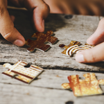
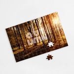
The personalised puzzle is an ideal product for unique gifts, promotional campaigns or family moments. Fully customisable with photos, messages or graphic designs, it’s a creative way to turn images into fun challenges. The result is an original piece that conveys emotion, reinforces branding and creates emotional connections.
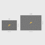
- Available with 96 or 408 pieces
- Sharp and long-lasting front print
- 170 gsm coated paper mounted on 2.5 mm cardboard
- Sturdy structure with excellent finish
- Perfect as a creative giveaway or memorable gift
Puzzle (Marketing Materials)
Share
Designs
Custom Puzzle – A Unique and Memorable Gift
Personalized puzzles transform photos and designs into engaging challenges for all ages. Whether as a special gift, a decorative piece, or a personalized keepsake, this product combines fun and creativity in one object. Customize it with images, logos, or unique messages to create something truly exclusive.
High-Quality Materials and Two Piece Options
Made with durable materials, these puzzles ensure a perfect fit and long-lasting quality. The high-definition printing is done on 170 g/m² paper and laminated onto 2.5 mm compact cardboard, ensuring resistance and a premium finish. Available in two formats:
- 315 x 210 mm with 96 pieces – Simpler and ideal for children or beginners
- 446 x 315 mm with 408 pieces – A more challenging option for adults and puzzle enthusiasts
Create Your Custom Puzzle with Ask-to-Print’s Online Editor
With Ask-to-Print’s online editor, you can easily customize your puzzle with images, text, messages, and logos. Choose from ready-made templates or upload your own design. The tool allows you to preview all changes in real-time, ensuring that the final result matches your expectations exactly.
Order a Custom Puzzle at Affordable Prices with Professional Production
Whether for a special gift or personal use, custom puzzles are a creative way to immortalize moments. With budget-friendly and low-cost options, you can create an affordable puzzle without compromising on quality. Easily personalize your puzzle online, adjust the design to your preference, and preview the final result before production. You can upload a special photo, design something unique, or even add a personalized message. Production is carried out with high precision to ensure a professional finish and a durable final product. Order now and receive an exclusive and memorable puzzle!
FAQs
Marketing Materials
Yes. Most of our products allow double-sided printing, including cards, posters, displays, puzzles, and coasters. This option gives you more space to communicate your message, add contact information, or create a stronger visual impact.
We offer a wide range of papers, from premium options such as matte or gloss coated paper to eco-friendly alternatives like recycled paper, cotton paper, and hemp blends. The options vary depending on the product and are clearly listed in the customization settings.
Yes. For many marketing products like cards, bookmarks, or postcards, we offer low quantities ideal for testing, specific events, or small promotional campaigns.
Yes. We use high-weight papers and, in many cases, offer optional lamination to protect against wear, stains, or folds. Products like loyalty cards, coasters, or hand fans are designed for repeated use.
Yes. You can choose from many customisable templates in the Ask-to-Print gallery or use our free online editor, which allows you to preview your design in real time. If you already have a ready-made design, you can upload it directly in various supported formats.
Yes. Many products offer finishes such as glossy or matte lamination, spot varnish, rounded corners, and visual effects that enhance the impact and durability of your material. You can check the available finishes for each product.
Yes. Many of our products are available in versions with recycled paper, FSC® certification or printed with eco-friendly inks. This is an excellent way to promote your brand with environmental awareness. In general, and by conscious choice, Ask-to-Print strives to work with sustainable products and to offer eco-friendly alternatives.
It's very simple. Just upload a photo or image from your computer or phone and customize the design in our online editor. You can use a full image or combine it with one of our ready-made templates to create a unique puzzle.
The personalized puzzles are printed on 170 gsm paper, mounted on 2.5 mm thick compact cardboard. This material ensures excellent rigidity, durability, and a photo-quality print with a glossy finish.
Currently, custom sizes are not available. Two standard sizes are offered, with 96 or 408 pieces, ideal for creative gifts or fun family moments.
No. Our puzzles are delivered assembled and sealed in a protective bag. If you want to use it as a surprise (e.g., for a special proposal), we recommend ordering it for yourself, manually disassembling it, and repackaging it as desired.
Printing and Production
Yes. Ask-to-Print offers a Certified Colour Proof in A4 and A3 formats, produced in accordance with FOGRA and ISO 12647-7 standards. It allows you to validate colours, images, contrasts and the colour behaviour of the file before final production.
The proof includes a certification label and serves as a visual and technical reference for colour control. You can choose between FOGRA39, FOGRA51, FOGRA47 and FOGRA52 simulations, depending on the paper type and printing process.
To ensure a professional result when printing your graphic project, it's essential to follow a series of best practices. The file must be created from scratch using the correct format and dimensions, respecting the technical areas defined for bleed, trim and safety. Below is a full guide to correctly prepare your print-ready file.
1. Start with the correct final size
From the start, define the exact size of the final product. Avoid designing in a different size and adjusting it later. This ensures all elements remain proportional and well positioned, avoiding errors at export or printing stage.
2. Use bleed and safety margins
- Bleed: extend all visual elements at least 2 mm beyond the trim line.
- Trim line: indicates where the product will be physically cut.
- Safety area: keep text and important elements at least 3 mm from the trim line.
- Fold lines: avoid placing text too close to folds. Keep a safe distance from folds for legibility and to avoid distortion.
3. Balance visual hierarchy
Distribute page elements well: maintain good proportion between text, images, and white space. Make sure the content is clear, well-organised and visually harmonious. Overcrowded designs can confuse or impair reading.
4. Choose legible and proportional fonts
- Avoid overly thin or decorative fonts for text blocks.
- Use appropriate font sizes — ideally test with a full-size print to confirm legibility.
- Ensure good contrast between text and background for easier reading.
5. Use images with adequate resolution
- Images should be at least 300 dpi at final print size.
- Avoid using web images, as they usually have low resolution and compromise visual quality. If used, always check the resolution.
- Ensure all images are in CMYK mode. RGB images may shift in colour when printed. Remember, printing is always done in CMYK colour mode.
6. Proofread all text before exporting
- Check for spelling or grammatical errors.
- Verify that all titles, headings and text blocks are correctly aligned and styled.
- When exporting, embed fonts in the PDF or convert them to outlines.
7. Define a consistent visual style
Choose a colour palette, typography and graphic style consistent with your brand or product purpose. A consistent design communicates professionalism and clarity.
8. Use the supplied design template
When using templates from the platform or the free Ask-to-Print Online Editor, place elements according to the guide lines. These lines indicate bleed, trim, fold and safety zones. You can also start your project from scratch in the editor and ensure proper element positioning.
9. Be careful with free online editors
Some online PDF editors don't correctly embed fonts, which can lead to font replacements or display issues. When possible, export the PDF with full font embedding and validate using a professional PDF viewer.
10. Use proper tools to create your design
To properly prepare your file, use the Ask-to-Print Online Editor or professional graphic software that supports technical margin setup and professional formats.
Common professional solutions include Adobe Illustrator, InDesign, Photoshop and CorelDRAW. These programs offer full control over vectors, fonts, bleeds and layers — ideal for advanced graphic production.
For free options, consider Canva (Pro version recommended for export), Inkscape (vector-based) and GIMP (image editing). While less robust, these tools can deliver quality files when used within printing specs.
11. Export correctly to PDF for print
Once your design is finished, export the file as PDF, following these essential requirements to ensure quality and print compatibility:
- Embed all fonts in the final PDF (prevents errors and substitutions).
- Ensure images are CMYK and 300 dpi at final print size.
- Use the PDF/X-1a export profile — ensures compatibility with prepress systems and printing machines.
- Include external bleed and visible trim marks when margin validation is required.
For step-by-step guides on how to export correctly in each program, see our PDF print export FAQ.
Na Ask-to-Print, a verificação do ficheiro depende da opção selecionada no momento da encomenda. Pode escolher entre três níveis de validação, consoante o tipo de apoio que pretende antes de avançar para impressão.
Não Verificar Ficheiro
Ao selecionar esta opção, confirma que o ficheiro enviado está correto, finalizado e pronto para impressão. Neste caso, o ficheiro segue diretamente para produção, sem qualquer verificação técnica prévia. Esta opção não tem custos adicionais.
Verificar Ficheiro
Ao selecionar esta opção, o seu ficheiro será analisado por um profissional antes de seguir para impressão. Se forem identificados erros ou inconformidades, será contactado antes de avançarmos com a produção. Esta opção tem um custo associado.
Verificar e Corrigir
Ao selecionar esta opção, o seu ficheiro será analisado por um profissional antes da impressão. Se forem detetados erros ou inconformidades passíveis de correção técnica, estes serão ajustados antes de o ficheiro seguir para produção. Esta opção tem um custo associado.
Que tipos de erros podem ser verificados?
A verificação pode abranger, entre outros aspetos técnicos, situações como:
- resolução insuficiente de imagens;
- dimensões incorretas do ficheiro;
- ausência de margens de segurança;
- falta de sangramento, bleed ou margem de corte;
- textos ou elementos demasiado próximos da linha de corte;
- utilização de modo de cor incorreto;
- fontes não convertidas em contornos ou não incorporadas;
- elementos em falta ou mal posicionados;
- páginas trocadas ou orientação incorreta;
- linhas de corte, marcas ou outros elementos técnicos indevidos na arte-final.
A análise incide sobretudo sobre a preparação técnica do ficheiro para impressão. Sempre que necessário, e de acordo com a opção escolhida, o cliente será informado ou o ficheiro será corrigido antes da produção.
Importa ainda referir que o serviço de correção não deve ser entendido como um serviço de design gráfico, reformulação criativa ou reconstrução de elementos da arte-final.
At Ask-to-Print, we accept various file formats to ensure the best customization and production experience. However, not all formats offer the same features in the design checking and adjustment process.
See below for file type details:
Files with Preview and Editable Options (recommended and preferred)
- .pdf (Adobe Acrobat)
- .png (PNG Image)
- .jpeg / .jpg (JPEG Image)
- .tiff (TIFF Image)
- .svg (Vector Graphic)
Files with Preview, No Editing Options
- .ai (Adobe Illustrator)
- .eps (PostScript)
- .gif (GIF Image)
Accepted Files, No Preview or Editing Options
- .psd (Adobe Photoshop)
- .cdr (CorelDRAW)
Files Not Accepted by the Platform
- .ppt (Microsoft PowerPoint)
- .doc (Microsoft Word)
- .bmp (Bitmap Image)
Still have questions?
If you're unsure about the correct format or are having trouble uploading your file, our Customer Support team is here to help. Don’t hesitate to contact us — we’ll be happy to assist and ensure your order runs smoothly.
To contact us click here!
When preparing a file for printing, it's essential to understand the difference between the two main colour models used in graphic design: CMYK and RGB. Although both allow for attractive visuals, they serve different purposes and produce different results — especially in print processes.
What are CMYK and RGB colours, and which should I use for printing?
CMYK – The colour model for printing
CMYK stands for Cyan, Magenta, Yellow, and Black. It is the colour model used in all professional printing processes. Colours are created by overlaying percentages of these four inks in layers on the printed surface.
- Used in offset and digital printing.
- Based on subtractive colour from reflected light — unlike screen-emitted light.
- Reproduces a more limited colour gamut, but one suited to the physical printing process.
RGB – Colour model for screens
RGB stands for Red, Green, and Blue. It’s a light-emitting colour model used for displaying colours on digital screens such as monitors, tablets, or smartphones. This model can produce much more vibrant and saturated colours than CMYK.
- Ideal for digital images, videos, and websites.
- Offers a wider colour gamut — meaning it covers more possible colours.
- Colours may appear more intense on screen than what can be printed.
What is colour gamut?
The gamut is the range of colours that a given colour model or device can reproduce. The RGB model has a wider gamut than CMYK, meaning it can display colours that simply cannot be printed with standard inks.
When a file created in RGB is automatically converted to CMYK, colours outside the CMYK gamut are adjusted to approximate values. This can result in noticeable visual differences between what is seen on screen and what gets printed — especially with certain RGB-exclusive or highly vibrant tones.
Which should I use when preparing files for print?
You should always work in CMYK colour mode when creating files intended for print. This ensures that what you see during design stays closer to what can realistically be printed.
If you're using design programs such as Adobe Illustrator, InDesign, or Photoshop, set the colour space to CMYK from the start. On Canva, choose CMYK export (available on the Pro version). This practice prevents colour fidelity loss.
On the Ask-to-Print Online Editor, there’s no need to worry: all files are automatically generated in CMYK with optimised colour management.
Useful tip for professionals and beginners
Even when working in CMYK, differences between screen and print may persist. We recommend using a physical CMYK colour guide to visualise true tonal values before finalising your design. This is especially helpful for branding or colour-critical materials.
Yes. The PDF/X-1a format is accepted by Ask-to-Print and is one of the most recommended options for finalised files. This format ensures that your design is reproduced accurately, preserving embedded fonts, CMYK colours and removing transparencies that may cause printing issues. If your file is production-ready, PDF/X-1a is an excellent choice.
Does Ask-to-Print recommend the PDF/X-1a format?
We strongly recommend using PDF/X-1a whenever uploading a finalised file, especially for technically demanding products such as business cards, flyers or catalogues. This format offers greater compatibility with our production systems and reduces the chance of errors related to fonts, colours or bleed margins.
When should I use the PDF/X-1a format?
PDF/X-1a is ideal for files that require no further editing and are ready for print. If you created your design in software like Adobe Illustrator, InDesign or CorelDRAW and want to preserve the exact layout, this is the safest format. It's especially useful for designs with pure CMYK colours, high-resolution images and where final alignment is crucial.
Does PDF/X-1a guarantee better print quality?
More than quality, PDF/X-1a guarantees consistency and reliability. It prevents issues like font substitution, incorrect colour profiles or unhandled transparencies. The visual quality also depends on resolution and layout, but this format ensures what you see on screen is what gets printed — no surprises.
How can I generate a PDF/X-1a file?
You can generate a PDF/X-1a from programs like Adobe Illustrator, InDesign, Photoshop or CorelDRAW. Just select “Save as PDF” and choose the PDF/X-1a:2001 preset. Make sure to use CMYK colour mode, include 3 mm bleed and convert text to outlines. You can also download our pre-configured templates to simplify the process.
What are the advantages of sending a file in PDF/X-1a?
Better print safety; Preserves fonts, images and colours; Reduces technical error risks; Compatible with prepress systems; Prevents layout surprises. By choosing this format, you're ensuring your file meets best practices in the graphic arts industry.
At Ask-to-Print, you can request a custom cut for various types of products. This cut refers to a shape that differs from the traditional rectangular or square format — such as special contours, curves, interior cutouts or decorative forms.
In the graphic industry, the term custom cut is often referred to as a “die cut” or “cutting line”, and applies both to the traditional blade-based process and to digital cutting (laser or cutting table), which is commonly used for large formats.
How to create a file with a custom cut
If your order includes a custom cut, please prepare your file as follows:
- Create a layer named CutContour.
- Draw the cutting path in the desired shape. The path must be made of continuous and closed vectors.
- Apply a Spot Color named CutContour to the path, using 100% magenta.
- If there are overlapping vectors, make sure they are combined properly.
Important technical rules
- The cutting path must be vector-based — raster images (JPEG, PNG, TIFF) are not valid.
- Ensure the line is closed and has no overlaps.
- Follow the product template guidelines for minimum radii and minimum width of cut areas.
- Avoid overly complex shapes such as tight curves or sharp angles.
- All printable elements must be on a separate layer named Artwork.
- The magenta cutting line will not be printed — it is only a technical reference for the cut.
Bleed and cutting line
To ensure a flawless result and avoid unwanted white edges, the cutting path should slightly overlap the image. Therefore, we recommend applying a minimum bleed of 3 mm for small formats and 5 mm for large formats around the cut area. This ensures the background or image extends beyond the cut line, providing a continuous and clean finish.
Recommended software
To properly prepare the custom cut, use vector illustration software such as Adobe Illustrator, CorelDRAW, InkScape, or other tools compatible with layers and spot colors.
Need help?
If you have any questions or need assistance, our team is always available to help. To check our contact details, click here.
Yes, you can view a proof before printing.
If you use our online editor, you’ll get instant access to a real-time preview of your design, accurately simulating the final result.
If you choose to upload your design or final artwork, you will also be able to preview the job before production — as long as the file is in one of the following formats compatible with digital proofing:
- PDF: Standard format for design previews.
- JPEG and JPG: Image format
- PNG
- GIF: Supported in the proofing process, allowing visual validation before printing.
- Tiff
- AI
- SVG
We accept many other formats, but only these allow automatic job preview generation.
The certifications FSC® (Forest Stewardship Council®) and PEFC® (Programme for the Endorsement of Forest Certification) ensure that the paper used comes from responsibly and sustainably managed forests.
The FSC® certification ensures that forest materials come from sources that comply with strict environmental, social and economic standards. Its goal is to protect biodiversity, workers' rights and local communities, and to promote forest regeneration.
The PEFC® certification confirms that the paper originates from forests managed sustainably, according to internationally recognised standards. This system values good forestry practices and is especially relevant in regions where small-scale or private forest management plays an important role.
Both labels demonstrate a commitment to sustainability and help consumers make more conscious and responsible choices.
Production Files
The final artwork is the final file prepared for production; the editable file is the working document that may still contain layers, fonts, linked images and elements that can be modified.
- Send the final artwork once the design is complete and reviewed.
- Always keep an editable copy for future changes.
- Send the editable file only when requested or when technical support is needed to prepare the artwork.
A low-resolution file may result in pixelation, lack of sharpness, irregular edges and loss of detail in the final product.
Resolution should always be assessed at the actual production size. Artificially enlarging a small image does not restore the original detail and may further reduce image quality.
Whenever possible, use high-resolution images or vector graphics. Take particular care with images downloaded from the Internet, as they are often optimised for screens and may not have sufficient resolution for graphic production.
When creating a design using very specific fonts or fonts that may not be available in our system, those fonts may be automatically replaced with standard fonts, which can significantly alter the appearance of your printed material.
How does this happen?
If the font used in your design is not embedded in the file or is not a common font recognized by our system, the print software will attempt to replace it with a similar one. However, this substitution may cause your design to lose its original appearance, affecting spacing, formatting and layout.
How to avoid this issue?
To ensure your design prints exactly as intended, follow these steps:
- Embed fonts in the final file: Make sure all fonts used in your project are properly embedded in the design file. This can be done when exporting the file from your design software (such as Illustrator, InDesign, Corel Draw, or others).
- Convert text to outlines: If you can’t embed the fonts, an alternative is to convert the text to outlines (or paths). This transforms the text into vector shapes, eliminating the need for external fonts. Note: This option is not recommended for products like Books, Magazines or Catalogues, as outlined text cannot be edited later.
- Check fonts and images in your file: Graphic design software such as Illustrator offers tools to ensure everything is correct before sending your file to print. One way to do this is to generate a final report that lists all fonts used and includes details about images, such as whether they are in CMYK or RGB mode (remember that for printing, images must be in CMYK).
- To generate the report in Illustrator:
- Go to the “File” menu >“Package”.
- In the Package options panel, check the boxes to include fonts and images.
- Illustrator will create a folder with all your project files, including embedded fonts, images (with CMYK or RGB info), and other essential details.
- To generate the report in Illustrator:
- Use the Illustrator Package feature: This is ideal to ensure that all resources required for your project are properly delivered. The Package generates a folder containing all design elements (fonts, images, colours, and more), making it easier to review everything.
Summary
To avoid font issues and ensure your design prints exactly as intended, embed fonts or convert them to outlines.
Embedding fonts in a PDF is essential to ensure the file is viewed and printed correctly on devices that may not have the same fonts installed. This practice is especially important in web-to-print environments, where files are prepared by end users and sent directly to print production.
What does embedding fonts mean?
When you embed fonts in a PDF file, the font data is included directly within the document. This preserves the text’s appearance, even if the PDF is opened on different computers, using different systems or without the original fonts installed.
How to embed fonts – General Steps
Adobe InDesign, Illustrator and Photoshop
- Go to File > Export and choose the Adobe PDF format.
- Access the Advanced tab.
- Enable the option Embed All Fonts or Subset fonts below 100%.
- Select a profile like PDF/X-1a or PDF/X-4, suitable for professional printing.
CorelDRAW
- Go to File > Export > PDF.
- In the Advanced tab, select Embed All Fonts.
Other programs (Affinity Designer, Canva, Inkscape, GIMP, etc.)
- Most export to PDF with fonts embedded by default.
- Always check export options for terms like "embed fonts" or "PDF/X compliance".
Best Practices for Web-to-Print
- Converting text to outlines is a safe option if the file doesn’t need further editing.
- Only use licensed fonts to avoid embedding restrictions.
- Avoid online fonts from cloud editors that don’t allow embedding.
What is rich black and when should it be used?
In graphic design for print, there are two main ways to apply black: plain black (100% K) and rich black. While both may look the same on screen, the printed result can differ significantly depending on the method used.
Plain black (100% K)
Plain black uses only black ink (K = 100%) in the CMYK model. It is ideal for text and fine elements, ensuring clarity, readability and no registration issues. However, when used in large solid areas (e.g., backgrounds), it may appear dull or greyish, as it relies on a single layer of ink.
Rich black – Greater intensity and depth
Rich black is created by combining black ink with controlled amounts of cyan, magenta and yellow (CMY). This blend enhances visual density and results in a deeper, more even black. It is especially effective for dark backgrounds, large blocks or visually impactful elements.
A safe and commonly used rich black formula is:
- C: 60%
- M: 40%
- Y: 40%
- K: 100%
These percentages may vary slightly depending on the paper type and print profile, but total ink coverage must always be respected.
Best practices when using rich black
- Use plain black (100% K) for text, fine lines and small elements — avoids registration issues.
- Use rich black for large areas, dark backgrounds or impactful visuals.
- Avoid using 100% for all colours (C+M+Y+K), as it may cause ink overload and drying issues — use our recommended formula instead.
Final Artwork – Paper Printing
Para garantir um resultado profissional na impressão do seu projeto gráfico, é fundamental seguir uma série de boas práticas. O ficheiro deve ser criado de raiz no formato e nas dimensões corretas, respeitando as áreas técnicas definidas para corte, dobra e segurança. Abaixo apresentamos um guia completo para preparar corretamente o seu ficheiro de arte-final.
1. Comece com o formato final correto
Desde o início, defina o tamanho exato do produto final. Evite criar o design noutro formato e ajustá-lo posteriormente. Trabalhar logo nas dimensões corretas garante que todos os elementos se mantêm proporcionais e bem posicionados, reduzindo o risco de erros no momento da exportação ou impressão.
2. Trabalhe com margens e sangrias
- Margem de sangria (bleed): estenda fundos, imagens e restantes elementos que chegam ao limite pelo menos 2 mm além da linha de corte.
- Linha de corte: indica o local onde o produto será fisicamente cortado. Podem ocorrer pequenas variações durante o acabamento.
- Área de segurança: mantenha textos, logótipos e elementos importantes a pelo menos 3 mm da linha de corte.
- Linhas de dobra: não coloque textos ou elementos importantes junto às dobras. Mantenha uma distância de segurança que preserve a legibilidade e evite distorções.
Atenção: quando existir um modelo gráfico específico, as medidas e indicações apresentadas nesse modelo prevalecem sobre estas recomendações gerais.
3. Design: equilíbrio visual, hierarquia e funcionalidade
Distribua os elementos de forma equilibrada. Mantenha uma boa proporção entre textos, imagens e espaços em branco e organize a informação por ordem de importância. Um design claro e visualmente harmonioso facilita a leitura; o excesso de elementos pode confundir a mensagem e prejudicar o resultado final.
4. Escolha fontes legíveis e proporcionais
- Evite fontes demasiado finas ou decorativas em blocos de texto.
- Utilize tamanhos de letra adequados ao formato final. Sempre que possível, faça um teste de impressão em tamanho real para verificar a legibilidade.
- Garanta um bom contraste entre o texto e o fundo.
- Evite linhas, contornos e pequenos detalhes cuja espessura possa desaparecer ou perder definição na impressão.
5. Utilize imagens com resolução e cores adequadas
- As imagens devem ter uma resolução mínima de 300 ppp/dpi no tamanho final de impressão.
- Evite imagens retiradas da Internet. Muitas têm baixa resolução e podem ficar desfocadas ou pixelizadas. Se as utilizar, confirme sempre a resolução efetiva à dimensão final.
- Utilize sempre CMYK: todas as imagens, cores e elementos gráficos devem estar definidos em CMYK, exceto quando o trabalho utilizar uma cor direta previamente selecionada.
- Nunca utilize RGB: o modo RGB destina-se a ecrãs e não à produção gráfica. A conversão de RGB para CMYK pode alterar tonalidades, brilho e saturação.
- Cores diretas: quando forem necessárias, selecione e identifique corretamente a cor direta pretendida, utilizando a referência indicada. Não simule uma cor direta através de valores RGB.
Regra de cor: o ficheiro final deve utilizar exclusivamente cores CMYK ou cores diretas devidamente identificadas. Não devem permanecer objetos, imagens ou efeitos em RGB.
6. Faça a revisão de todos os textos antes de exportar
- Confirme que não existem erros ortográficos, gramaticais ou informação desatualizada.
- Verifique se títulos, chamadas e blocos de texto estão corretamente alinhados e formatados.
- Confirme nomes, contactos, datas, preços, referências e restantes dados variáveis.
- Depois da revisão, incorpore as fontes no PDF ou converta todos os textos em vetores, curvas ou contornos.
Importante: guarde uma cópia editável antes de converter os textos em vetores. Depois da conversão, o conteúdo deixa de poder ser corrigido como texto.
7. Defina um estilo visual consistente
Escolha uma paleta de cores, uma tipografia e um estilo gráfico coerentes com a sua marca e com o objetivo do produto. Utilize os mesmos critérios ao longo de todas as páginas ou faces. Um design consistente transmite profissionalismo e facilita a compreensão da mensagem.
8. Use o modelo gráfico fornecido
Quando estiver disponível um modelo gráfico na plataforma, utilize-o para preparar a arte-final. Posicione os elementos de acordo com as linhas-guia, que identificam a sangria, o corte, as dobras e a área de segurança.
- Não altere o tamanho, a proporção ou a orientação do modelo.
- Mantenha os elementos importantes dentro da área de segurança.
- Prolongue fundos e imagens até à margem de sangria.
- Antes de exportar, elimine ou oculte linhas, instruções e elementos técnicos que não devam ser impressos.
Também pode criar o projeto de raiz no Editor Online gratuito da Ask-to-Print. Confirme sempre que o formato e o posicionamento dos elementos correspondem às especificações do produto.
9. Tenha atenção aos editores online gratuitos
Alguns editores online não incorporam corretamente as fontes, não preservam cores CMYK ou alteram a estrutura do PDF. Isso pode causar substituições de fontes, mudanças de cor, perda de qualidade ou erros de visualização. Sempre que possível, utilize configurações próprias para impressão e valide o ficheiro final num visualizador de PDF profissional.
10. Escolha ferramentas adequadas para criar o design
Para preparar corretamente o ficheiro gráfico, utilize o Editor Online da Ask-to-Print ou programas especializados que permitam controlar formatos, cores, imagens, fontes, sangrias e áreas técnicas.
Entre as soluções profissionais mais comuns estão o Adobe Illustrator, InDesign, Photoshop e CorelDRAW, bem como o Affinity, que é gratuito. Estes programas oferecem maior controlo sobre vetores, fontes, sangrias, cores e camadas, sendo adequados para produção gráfica avançada.
Como alternativas, podem ser utilizadas ferramentas como Canva — com a versão Pro recomendada para exportação —, Inkscape e GIMP. Estas soluções permitem criar ficheiros de boa qualidade, desde que sejam respeitados todos os requisitos técnicos e que o ficheiro final seja exportado em CMYK ou com as cores diretas pretendidas.
11. Exporte corretamente o PDF para impressão — Checklist final
Depois de concluir o design, exporte o ficheiro em PDF para impressão. Antes do envio, confirme os seguintes pontos:
- O documento mantém o formato final correto.
- A sangria externa de 2 mm está incluída em todos os lados necessários.
- Todas as imagens têm 300 ppp/dpi no tamanho final de impressão.
- Todas as imagens, cores e elementos estão em CMYK ou utilizam cores diretas corretamente identificadas.
- Não existem elementos em RGB. Verifique também imagens incorporadas, efeitos, sombras, transparências e objetos importados.
- Todas as fontes estão incorporadas ou os textos foram convertidos em vetores, curvas ou contornos.
- O perfil de exportação utilizado é PDF/X-1a, garantindo maior compatibilidade com os sistemas de pré-impressão e produção gráfica.
- As marcas de corte só são incluídas quando forem solicitadas ou necessárias para validação.
- O PDF final foi aberto e revisto depois da exportação.
Para saber como guardar o ficheiro com estas configurações em diferentes programas, consulte a FAQ de exportação de PDF para impressão.
A final artwork file is the final version of the design, technically prepared for production. It should contain text, images, colours, dimensions and graphic elements correctly configured for the chosen printing or personalisation process.
The requirements vary depending on the material and production technique, such as paper printing, large format printing, textile personalisation, embroidery or promotional products. Whenever a technical product template is available, its specifications take priority over these general recommendations.
To apply spot UV varnish, create a vector design that represents exactly the areas where the varnish should be applied.
This design may include shapes, symbols, logos or text converted to vectors and will act as the technical mask for the finishing effect.
- Place all varnish elements on a separate layer and name it Finishing.
- Apply a 100% Magenta Spot Colour to the elements and also name the Spot Colour Finishing.
- Enable Overprint on the mask elements.
- Keep the mask perfectly aligned with the printed artwork.
- Respect the minimum dimensions and any additional technical specifications indicated for the product.
The Finishing layer is used exclusively to identify the varnish application areas and will not be printed as a visible colour.
To apply stamping, embossing or debossing, create a vector design that represents exactly the areas where you want the effect to be applied.
This design may include shapes, symbols, logos or text converted to vectors and will act as the technical mask for the finishing effect.
- For stamping, place the elements on a separate layer named Finishing.
- For embossing or debossing, place the elements on a separate layer named Emboss.
- Apply a 100% Magenta Spot Colour to the elements and give it the same name as the corresponding layer: Finishing or Emboss.
- Enable Overprint on the mask elements.
- Keep the masks perfectly aligned with the printed artwork.
- When combining stamping and embossing on the same element, use both the Finishing and Emboss layers, correctly aligned.
- Respect the minimum dimensions and any additional technical specifications indicated for the product.
The Finishing and Emboss layers are used exclusively to identify the finishing areas and will not be printed as visible colours.
To create a custom paper cut, draw a closed vector path that represents exactly the intended final shape.
This path will act as the technical cutting line and must be kept separate from the printed artwork.
- Place the cutting path on a separate layer and name it CutContour.
- Apply a 100% Magenta Spot Colour to the path and also name it CutContour.
- Enable Overprint on the cutting path.
- Use a continuous, closed path with no overlaps.
- Extend backgrounds, images and any other elements that reach the edge beyond the cutting line, allowing for the bleed specified for the product of at least 2 mm.
- Keep text, logos and important elements within the corresponding safe area.
- Avoid excessively sharp angles, overly complex curves and very narrow shapes that may make cutting difficult.
- Respect the minimum dimensions and any additional technical specifications indicated for the product.
The CutContour layer is used exclusively to identify the cutting shape and will not be printed as part of the design.
When the product has multiple pages, front and back sides or folds, organise the file according to the final sequence of the product. Do not impose pages or place several pages on the same sheet, as page imposition is handled by the Ask-to-Print prepress team.
- Front and back: send the two sides as separate pages, normally the front on page 1 and the back on page 2, using the same size and orientation.
- Multiple pages: combine all pages into a single PDF and arrange them in the correct reading order.
- Folds and creases: prepare the content according to the product's technical template and keep text, logos and important elements away from fold lines.
- Covers or sides with a specific orientation: check the rotation and reading direction of each page before exporting.
For folded products, covers, packaging or products with specific geometries, use the technical template provided by Ask-to-Print to ensure the correct positioning of pages, sides, folds and creases.
The bleed margin (also called bleeding margin or by the English term bleed) is an additional area around the final design that must be included in the artwork file to ensure a clean and accurate cut. During the finishing process, slight variations of 1 to 2 mm in trimming are common. Bleed prevents these from resulting in unwanted white edges.
How to identify the bleed margin?
If you downloaded the template or used the online editor: you’ll find lines in different colours.
- The black line indicates the bleed margin.
- The red line indicates the cut line.
- The green line indicates the safety margin.
How to use the bleed margin correctly?
Always extend backgrounds, colours or background images up to the bleed margin — even if they don’t contain relevant elements. This ensures that, after cutting, no white stripes appear along the edges.
Practical example:
A design with a coloured background ending exactly at the cut line may show white borders if the trim shifts slightly. By extending the background to the bleed, this risk is eliminated.
Bleed margin dimensions by product type
| Bleed Margin | Products |
|---|---|
| 2 mm | All small and medium-size print products |
| 5 mm | All large format products and cardboard packaging |
| 10 mm | Corrugated cardboard packaging and shipping materials |
If you use our templates or our Online Editor, the bleed margins are already set automatically. Just follow the guide lines to ensure the correct placement of elements.
What is the Safety Margin?
Besides the bleed, it’s also important to respect the safety margin — an inner zone where all essential design elements should be placed to avoid being cut or ending up too close to the edge, compromising layout and readability.
Why is the safety margin necessary?
During trimming, small variations may occur. If text or logos are too close to the cut line, they risk being trimmed or becoming illegible. The safety margin ensures these elements remain intact and clearly visible.
How to correctly apply the safety margin?
- Keep text, logos and key graphic elements at least 3 mm from the cut line (or more, depending on the product).
- Avoid placing content near fold lines or technical cutting marks.
- Check that elements respect the area defined in the template (continuous red line).
Visual summary:
- Bleed (grey): extra area outside the cut → for backgrounds and images.
- Cut line (red): where the product will be physically trimmed.
- Safety margin (green): protected area → for text and key elements.
Respecting these technical areas ensures a professional finish, free from errors or unexpected results.
To ensure your file is ready for printing with special and highlight graphic finishes, it is essential to correctly prepare all embellishment elements.
This procedure applies to any product involving one or more of the following finishes:
- Spot UV varnish
- 3D varnish
- Embossing (raised and recessed)
- Stamped embossing
- Gold or silver foil
- Metallic effects
These effects can be combined with special cutting (CutContour). Therefore, each finish must be placed on a separate layer, with a properly assigned technical colour (Spot Colour) and the Overprint attribute always activated.
1. Use only vector elements
All special finish elements must be vector-based (not rasterized) to ensure accuracy and quality. Avoid using images or pixelated effects.
2. Create a separate layer for each finish type
Each finish must be placed on a distinct layer, with a specific technical name and dedicated Spot Colour application (see below).
3. Draw clean and closed paths
Avoid overlapping shapes, sharp angles or open paths. Use tools like Pathfinder (Illustrator) to unite, intersect or combine elements — ensuring simple and precise outlines.
4. Layer names and colours for finishes
According to the type of finish, you should create a specific layer with the correct technical name and apply a Spot Colour with the values defined below. All elements must have the Overprint attribute activated.
- Layer: Finishing
For: Spot UV varnish, 3D varnish, gold or silver foil, metallic effects
Spot Colour: C 0% M 50% Y 100% K 0% (orange tone)
Important: Elements must be vector-based and placed exclusively in this layer. Do not duplicate elements in other layers. - Layer: Emboss
For: Raised embossing, recessed embossing
Spot Colour: C 50% M 100% Y 0% K 0% (purple tone)
Important: The embossing must be drawn with closed vector shapes and properly aligned with the base artwork.
Attention: In cases where finishes are combined. If stamped embossing is required, you must create two separate layers with the respective configurations described above:
- Layer: Finishing + Layer: Emboss
For: Stamped embossing (combination of foil and embossing)
Configuration: Both layers must be correctly configured, with separated and aligned vector elements, without incorrect overlaps or duplications.
Additional note: If your product includes a customised special die cut, you must also set up an additional layer with the corresponding path:
- Layer: CutContour
For: Custom special cutting
Spot Colour: C 0% M 100% Y 100% K 0% (red)
Important: The cutting path must be vector-based, closed and placed on a separate layer. Avoid sharp angles and overlapping paths.
5. Activate overprint
All finish paths must have Overprint activated. This ensures the finish will be printed over the artwork without interference or failures.
6. Organise the layers correctly
- Artwork – layer with the main design (text, images, etc.)
- Finishing – for varnish, foil and metallics
- Emboss – for embossing
- CutContour – for cutting
- Do not duplicate elements between layers
7. Important technical care for special finishes
- Minimum text size: 10 pt
- Minimum line thickness: 1 pt
- Minimum distance between finish lines: 1 pt
- Safety margin: at least 3 mm between finish and cutting or creasing lines
8. Layer alignment
If the finish (varnish, foil or embossing) must align exactly with artwork elements, ensure that elements in the Artwork, Finishing,Emboss and CutContour layers are perfectly aligned.
9. Recommended tools
To correctly prepare your file, use vector illustration software such as Adobe Illustrator, CorelDRAW or InkScape, or other tools compatible with layers and spot colours.
Need help?
If you have any questions or need support, our team is always available to help you. To check our contacts click here.


